- Joined
- Apr 9, 2009
- Messages
- 41,401
- Reaction score
- 5,706
- Location
- Iowa
- Website
- kharrodphotography.blogspot.com
- Can others edit my Photos
- Photos OK to edit
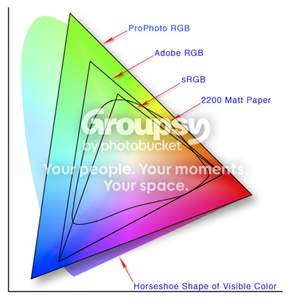
In Lightroom you are looking at the image in a color space (ProPhoto RGB) that has a much broader gamut than sRGB has.


![[No title]](/data/xfmg/thumbnail/35/35958-c5e3387cf4682d8c9cd7b7818c294709.jpg?1619737272)
![[No title]](/data/xfmg/thumbnail/35/35956-7047189d31e1c1f6029266079390f54a.jpg?1619737269)
![[No title]](/data/xfmg/thumbnail/32/32182-3ec35e12e238c681a086455c4586fbef.jpg?1619735235)

![[No title]](/data/xfmg/thumbnail/42/42023-bdd979ff50e78cc28479297780caeb90.jpg?1619739981)