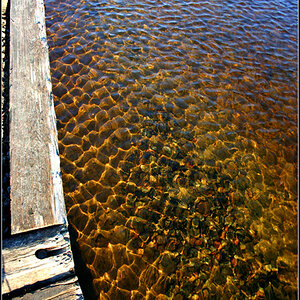
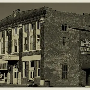
I'm not surprised you're undecided about Photo 3, woodsac, I am too. It looks quite, quite oversaturated to me. Even Photo 1 borders on "too saturated" for my liking, but is still within "the limit" (which is very much my own limit, I should point out, I am not setting any rule here), while Photo 3 is ... hmph... weeeeelllll.....
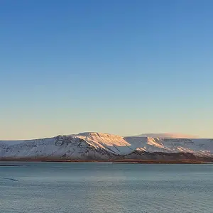
I like the find of Photo 2 and the colours but think it is cropped a bit tight. It would have been nice to see all of the whatever-it-is in the frame.
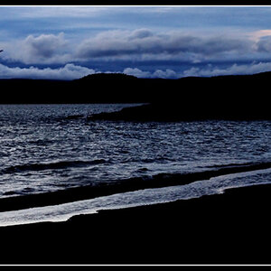
But the last consoles with every little flaw I might be detecting in the others - that last one is perfect.
(Am I the only one to instantly think "vonnagy" when I see this?)







 .
.


![[No title]](/data/xfmg/thumbnail/35/35946-771bfce9b2727c9126587d96c471da80.jpg?1734167737)


![[No title]](/data/xfmg/thumbnail/42/42493-2665d3a35f26795cc783aeb77329a032.jpg?1734177012)
![[No title]](/data/xfmg/thumbnail/31/31701-24a40368b575b319cb332e3114f39172.jpg?1734160369)
![[No title]](/data/xfmg/thumbnail/33/33362-84aacb865117bf8cba89104b89e9b36c.jpg?1734163304)