What's new

24 hour door repair

KenC

Been spending a lot of time on here!
Joined
Jan 18, 2010
Messages
5,699
Reaction score
1,472
Location
Philadelphia
Can others edit my Photos
Photos NOT OK to edit
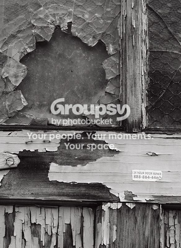
door090312.jpg


No, it's not tilted or taken at an angle. Nothing on this door was straight, so I lined up the window frame as vertical because that seemed best.
 
That's just awesome.

Purely a technical nit, but have you considered boosting contrast and sharpening just a bit? Might give it a bit more pop.
 
Nice. Is the door repair sticker real, or something you added in post?
 
Thanks guys!

Eric - the sticker is real. I actually considered making it unreadable so it would be just an abstract element in the composition and wouldn't draw attention to the text, but I guess I couldn't pass up the joke.

Chris - I noticed that it's missing something, and I think it's mostly from converting the psd to jpg and going through Photobucket, mostly the latter I think. This happens on some images, but not on most, and I wish I understood why so I could avoid it. Having said that, I will go back later and look at the psd and see if it really is OK on these counts. At the least, I suppose I will have to make a "juiced-up" psd for purposes of web display, unless there is some other way to preserve contrast.

 
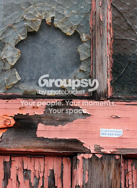
Why did you choose B&W for this shot? Could I see the color version? :D
 
Last edited:
I'm glad you didn't pass up the joke, as that gives this photo that extra point! Good.
I agree with manaheim on the contrasts - maybe just a smidge more?
 
Thanks!

Mishele - the paint is a red-brown color that I thought was too distracting, and I also wanted to lighten it in the conversion so it was lighter than the wood. I will post a color version tonight from home.

Corinna (and Chris) - I checked my files last night and Photobucket appears to have dulled the contrast. The psd and jpg files on my computer both definitely have more contrast than this (although perhaps still not enough for some tastes) and a touch more sharpness. If anyone has any theories on why PB does this to some images more than others I'd love to hear them.
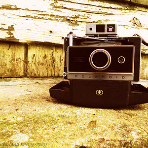
 
Thanks!

the paint is a red-brown color that I thought was too distracting, and I also wanted to lighten it in the conversion so it was lighter than the wood. I will post a color version tonight from home.

Totally agree with BW for more impact
The only nit I have with this great catch is that I would crop to get that sticker more in the corner.
Let the viewer find it and finally get the joke (?) rather than putting it so up front and pushing it in their face.
 
That is a great one!
 
Nice one! You did the right thing by going with B&W - aside from the joke, this one's all about texture. Color would lessen the impact. The color actually distracts from the joke, as well, since the print is so light in the color version. I can see how much contrast you've added by that alone. I usually agree with Lew's comments but in this case, I'd hate to see this image lose any of the lovely old peeling paint. :)
 

Create an account or login to comment

You must be a member in order to leave a comment

Create account

Create an account on our community. It's easy!

Log in

Already have an account? Log in here.

New Topics

Back
Top Bottom