
2WheelPhoto
TPF Noob!
- Joined
- Apr 14, 2011
- Messages
- 6,844
- Reaction score
- 996
- Location
- Tampa
- Can others edit my Photos
- Photos OK to edit
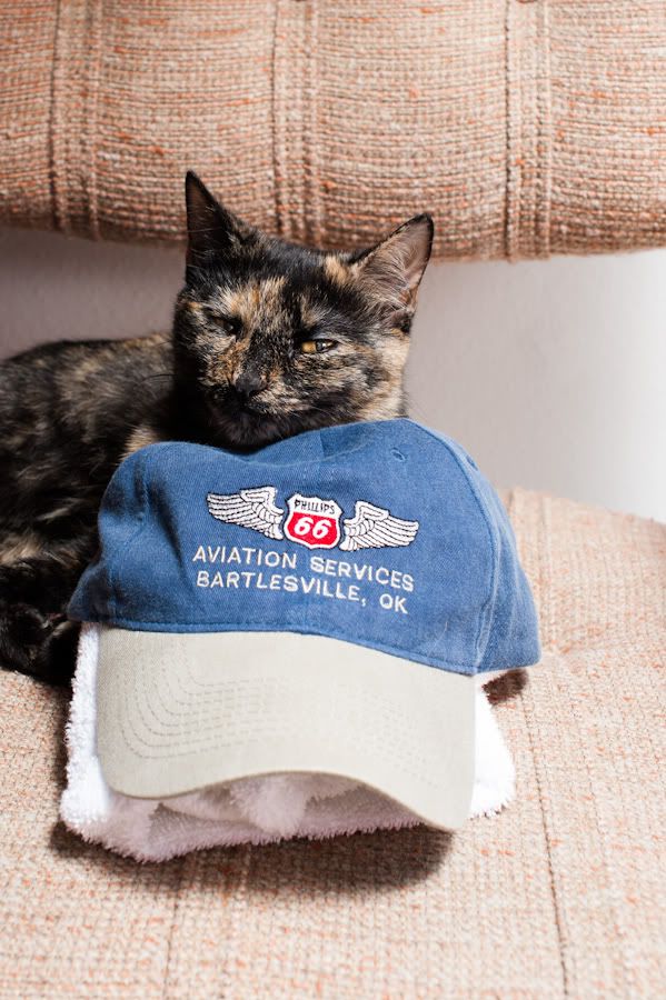
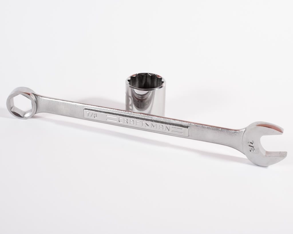
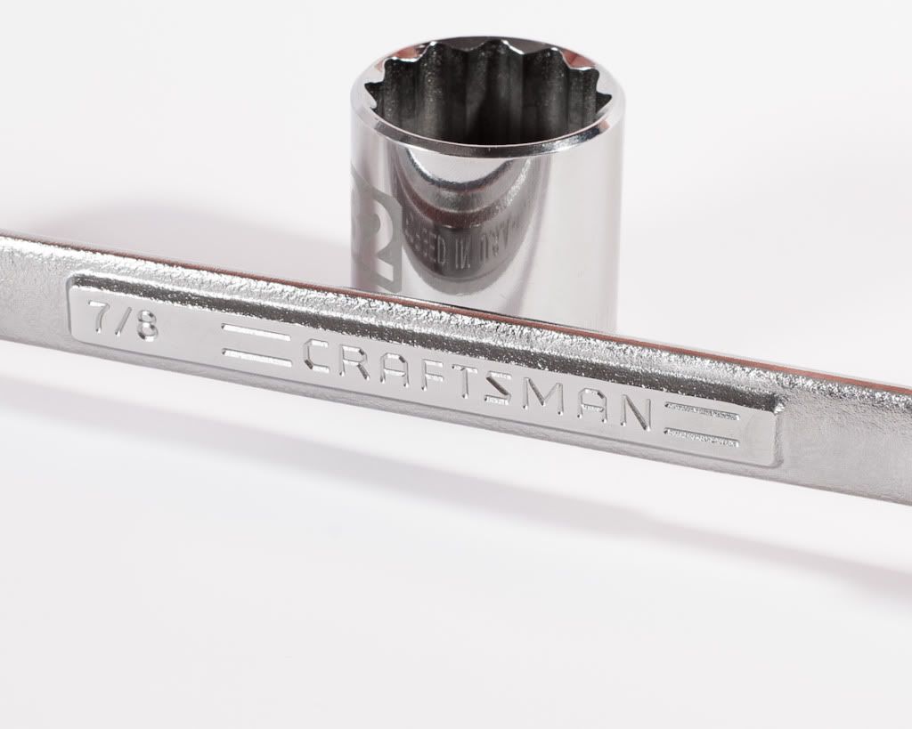
I'm brand new to product but wanted to give it a try. I'm more comfortable shooting breathing people by far. Can anyone see an obvious pattern going on here where I'm going down the wrong path or can improve something? I figure 4 photos should point it out.
I know the pics aren't good because when I look at the products on line for sale the pics are MUCH better

1) (the soft spot on the front is a real smear)
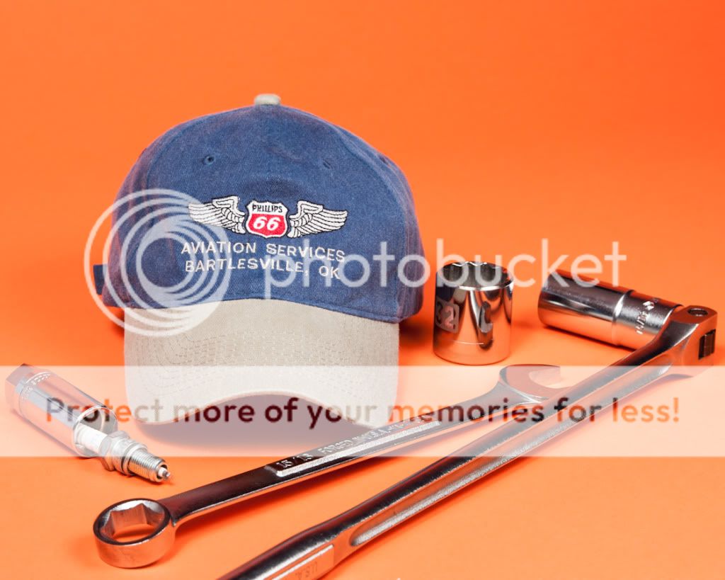
2)

3)
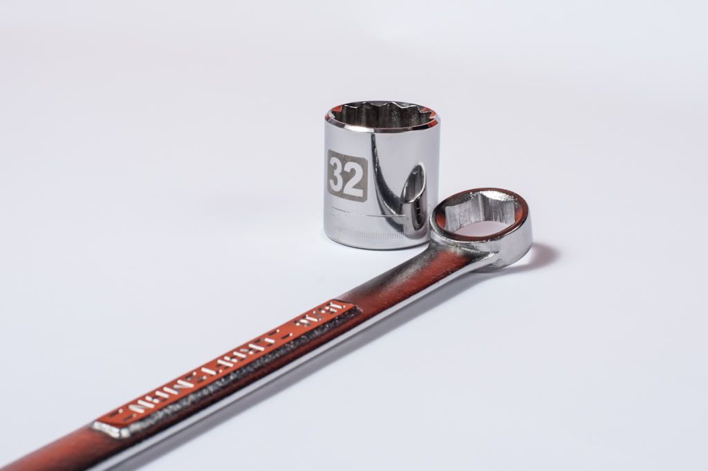
4)

5)
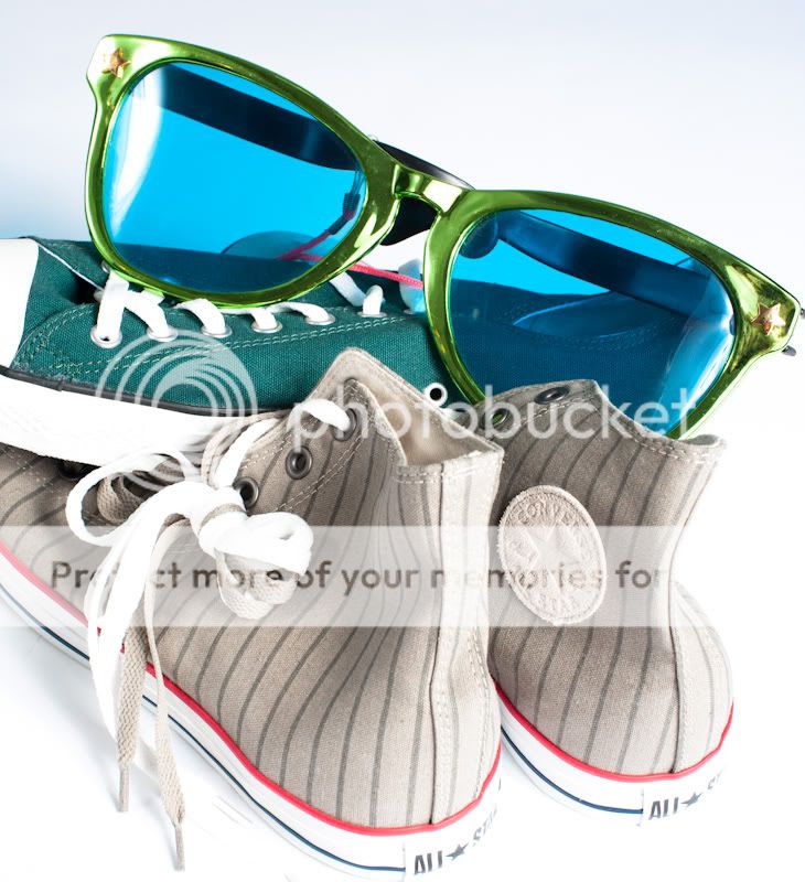
My assistant gets credit for anything done right =)
I know the pics aren't good because when I look at the products on line for sale the pics are MUCH better
1) (the soft spot on the front is a real smear)
2)
3)
4)
5)
My assistant gets credit for anything done right =)


![[No title]](/data/xfmg/thumbnail/32/32630-d78de94d84be2acf57d5e0923482b4da.jpg?1619735552)
![[No title]](/data/xfmg/thumbnail/35/35931-5e10675f3f7d827bc7ae4689f16bda8a.jpg?1619737234)

![[No title]](/data/xfmg/thumbnail/31/31705-3469470a562bc1a3bad361889544af19.jpg?1619734963)
![[No title]](/data/xfmg/thumbnail/34/34693-68d7ff80dc154cec1604c718d5434ecd.jpg?1619736605)

![[No title]](/data/xfmg/thumbnail/31/31704-42c2fcbcc4b6ba8c2c5ae54202cad6ec.jpg?1619734963)
![[No title]](/data/xfmg/thumbnail/35/35927-3dea4a63711f7a2bbdbb2abd760fcc04.jpg?1619737232)