Attempt at "Edgy" Prom Shots C&C

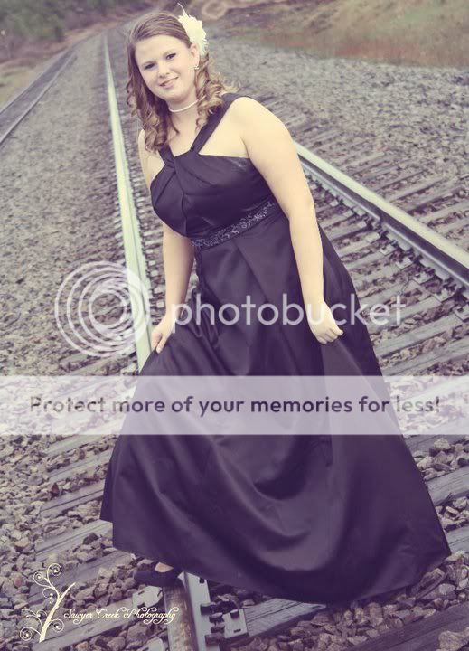
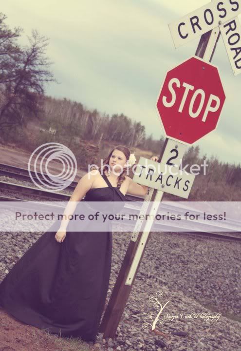
Did you go in quoting them a price or did they give you the money as a 'tip' or at their discretion? I've only had one paid shoot and I went into that shoot as a beginner like yourself and telling them (who are friends of mine) that I was doing this for practice and for no charge. When all was said and done, they tossed me 100 bucks as a tip b/c they loved the way their shots came out. I have an issue with people who are beginners asking others for money when they cannot come out with the sharpest focus possible. Trust me, I'm not pointing only you out, but all the others I see on fb making money off of shots like I described. Bitter put it the best way though, worded it like I wish I could lol.


About the actions...while it does tend to make some images worse (b/c like someone said, it doesn't account for anything off of your image, but the image it was created off of), if done correctly, actions can be very useful. I wouldn't get an action online, then run a batch edit on every image and leave it alone. Any action I run usually involves me fixing some things after it's been run on all my images. Actions are great for static environments where nothing changes though (if created by yourself)
 
WTF?
Is not anyone looking at whether the picture made the subject look good or interesting or something? Or just not willing to say anything?

Your sister is chubby; read http://www.google.com/search?sourceid=chrome&ie=UTF-8&q=photographing+heavy+peoplehttp://www.google.com/search?sourceid=chrome&ie=UTF-8&q=photographing+heavy+peoplesome threads on how to pose chunky people to minimize their faults and maximize their good features.
These pictures just seem to obliterate any good points and maximize the bad ones.
No eyes can be seen, skin color ranges from totally blah to hideous, straight on pose is absolutely terrible for heavy young girls in gowns.

No amount of edginess will transform these into something she will think makes her look good.
 
Great now I have that song stuck in my head...

smooooooooooth operatoorrrrrrrrrrr...
 
How is not using flash edgy? I would say a beauty dish is edgy (that's as edgy as I get)... But I guess you could do some raw builb flash which is sure to be edgy.... edgy
 
Last edited:
Not using flash or "natural light photographer" = Doesn't know how to use flash.

Told that by a very successful wedding photographer. (Which after going to their clinic thingy... I NEVER EVER EVER want to do a wedding. EVER.)
 
Well it was my little sisters junior prom and she didn't want to pay for the boring professional pictures at prom. So she asked me to come and do her hair, makeup and take her pictures. C&C please!!

1.
gyna.jpg


2.
gyna2.jpg


3.
gyna3.jpg


4.
gyna4.jpg


Thank you!

Composition is key and you're missing it here by framing

#1 to the left side facing out of the frame. This shot would have been better in "portrait mode"
#2 SAME
#3 I HATE horrible tilt to make it look like some form of action is taking place...lose the tilt!
#4 SAME + she's not the center of attention, rather the subject is the signage with a girl standing there....and that tilt...yucch.

Composition, framing the subject, focus and processing all need work. Good news is that it's really not all that difficult if you follow some basic rules/guidelines available all over this site. Cheers!
 
When I think "edgy", the first thing that comes to my mind is lighting, followed closely by composition and should or usually does include contrasting elements juxtaposed with the subject matter. I think it is good for you to have the mindset to attempt flipping the bird at "normal", but there is much more to it than you have shown here.

Take a look at these photographers. They were all interviewed in the April issue of Rangefinder magazine. I believe they have an edginess to their work. See what you think. What do you think? You can go to the archives of rangefindermag.com to read their interviews to discover their own interpretations of their visions.

Kingmond Young
Dirk Rees
Karina Ceja (it looks like her website is not fully intact. Here is the interview.)
 
Nope I don't know how to use off camera flash...........I could learn, if I choose to. I am choosing not to at this point. I LIKE the look of photography taken in all natural light and in my opinion you can not get studio lighting to look exactly the same as natural light.

Now I do hope to get some reflectors and learn how to work with the natural light better, but I'm not choosing natural light because I'm too stupid to figure out a flash.

The slight OOF I agree with for the bottom 2, the top 2 the originals are sharp. It is the vintage style editing that created the lack of sharpness.

The tilt.......I don't think it is intended to show movement at least not in my pictures, it is just a different perspective but I can understand that it appeals to some but not others.

I appreciate the input.........thanks!
 
The tilt.......I don't think it is intended to show movement at least not in my pictures, it is just a different perspective but I can understand that it appeals to some but not others.

I appreciate the input.........thanks!

This is what I was talking about. You defend everything you do, so why bother posting for CC?

The bolded part above shows that you understand absolutely nothing about composition and the elements of design. DIAGONALS ALWAYS SUGGEST MOVEMENT, whether you don't intend them to or not DOES NOT MATTER. It is NOT just a different perspective.

My advice to you is to get books on composition and the elements of design, for both photography, and art in general, and you will begin to understand.
If you choose to make excuses for the very good advice you have been given and ignore, so be it. But why waste peoples time?
 
I hate arriving late to the party, but...
C&C per req (and yes, I know some of the points below are already covered):

1. The wrong composition, IMO. It rarely works to have someone facing out of the image on the edge to which they are closest. Bust shots rarely work in landscape orientation. Go portrait or square. Pay attention to your background; the house/structure/whatever is very softly focused, but still distracting. Your exposure is, well, over-exposed. You've blown the highlights in the flower on her hair, have over-bright highlights on her skin, and racoon eyes all in one image. The monochrome isn't bad, but were it exposed correctly and given a slight contrast boost, it would be very nice.

2. Please explain the rationale behind having all these branches in the foreground! If you had composed it such that they all "pointed" to her, rather than covering her, it might work. Again note the busy background, trees "growing" out of her head, and exposure issues.

3. Railroad tracks are a cliche, but one I like. They make wonderful leading lines, but in this case they lead the viewers eye right past the subject and out of the image. Had you moved her just a little bit image left so that the left-hand rail stopped at her shoulder area it would have worked well. This processing reminds me of Kodacolor 135 processed at a 1-hour lab; NOT at all attractive. The angle is a personal choice; I'm not normally a fan of them, in this case, it's not too bad.

4. As mentioned, the sign is the focus, not your sister. Had you cropped it below the "Railroad Crossing" X, so that we didn't see part of a sign, it would be that much stronger. In this case I DON'T like the angle, but again, it's personal.

You've made repeated mention of the fact that you don't use flash, don't want to, don't want to learn, etc. You've also stated that flash pictures aren't as nice as natural light (or words to that effect). Well done flash images are are like a woman's make-up; hours of time and prep go into making something look like it's not there at all.

Photography is all about the control of light. Since there's very little we can control about natural light, it makes skill with supplemental light that much more essentail. If you have to look beyond the four cases of racoon eyes... To illustrate, look at this image (and yes, I know it's not seasonally appropriate): There are put whites, deep blacks and everything in between. Without supplemental light, this would have been an all but impossible shot; instead, a simple two light set-up produced a well exposed, pleasing image.


You've got a good start, but there are areas for improvement. Take the comments and critique and learn from it. You are not a better photographer because you insist on doing something the hard way. You clearly have desire and potential; exploit it!

Just my $00.02 worth - your mileage may vary.

~John
 
How about learning on camera flash?
 
I thought people were all suggesting off camera flash.

Picture #1-22 used reflector. Picture # 23 and higher were all shot with ON camera flash. If you only use a only a small power and use mostly ambient light, just use on camera flash. Off camera flash is a must outdoor if most of the light on the subject comes from the flash or your subject will look flat.

Usagani Photography | Weddings | Events | Portraits - Denver, CO | Stacy P
 

Most reactions

Back
Top