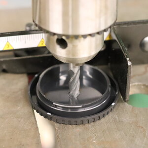
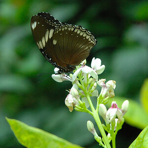
c and c please, two of my favorites
- Thread starter samcolby
- Start date


")
Most reactions
-
 420
420 -
 313
313 -
 287
287 -
 269
269 -
 260
260 -
 228
228 -
 197
197 -
 181
181 -
 167
167 -
 164
164 -
 144
144 -
 135
135 -
 135
135 -
 125
125 -
 103
103
Similar threads
- Locked
- Sticky


![[No title]](/data/xfmg/thumbnail/35/35262-02f8eba4a2a92dbae0b55547bba80b4f.jpg?1619736968)

![[No title]](/data/xfmg/thumbnail/35/35265-c9ea3efd2c618a57ea136e63ad106880.jpg?1619736970)