What's new

C&C on photos to send to professional

lrc3233

TPF Noob!
Joined
Oct 2, 2011
Messages
12
Reaction score
1
Location
Boston
Can others edit my Photos
Photos OK to edit
Edit: Whoops, I guess this is the wrong forum now. Sorry about that. How can I change it?? :(

Hello again,

Well, I am taking photos all the time while we are traveling so I have loads of photos, but our traveling time is winding down and we're having to think about what we'll do when we get back home. I have contacted a photographer (photography is only a part of her work, she also does scientific research and teaching) to see if I could work with her and she asked for a few jpgs so she could see my "eye". She does lots of macro work and quite a few of her photographs are abstract so I have included some wider views and close cropped compositions.

I have some photos that I think are pretty good, but I don't really know because I don't have anyone to critique them besides my husband and friends who say they're all great. So anyway, I've picked out a few pictures that I think are nice to send to her and I would love some feedback about the collection, "my eye", and what I can improve about my photography in general.

So, thanks for any feedback!!

1.
6858982010_9e02b17398_b.jpg


2.
6817376576_49397c4644_b.jpg


3.
6948355499_e840c3b875_c.jpg


4.
6882049229_500a264f7f_b.jpg


5.
6689117971_4529e7a03a_b.jpg


6.
6689112233_dac0dc4a79_b.jpg
 
Last edited:
The abstracts are nice, and I think you've got some good ideas.

Try studying up on color management.
 
Just my opinion. . . but, if you are looking for photos that best describe you and your "eye" for photography, then I would think you would want to pick the photos that YOU think are your best (not our opinions).

Asking "what photos should I send to a professional" and "critique my work" are two very different questions.

The photos are nice, #4 looks blown out.
 
I'm sure one of the other mods will be along shortly to move this to the correct forum (my work browser doesn't let me access all the admin tools or I would).

C&C per req:

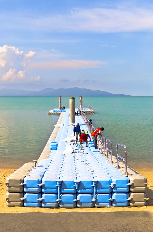
1. I like the scene and the basic composition, but a few things come to mind. One is that the blues of the top of the pier are so bright as to be nearly blown, and the whites are blown. The other is that the sky is a bit insipid. The use of a graduated ND filter and a polarizing filter would have really helped this image. would consider cropping out the foreground shadow on the sand which will also move the horizon out of the centre of the image.

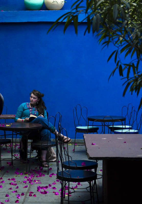
2. Holy under-exposure and cold WB Batman!!! To be honest, I'm not sure what the point of this image is. It's very cold, it's underexposed, and there's no discernable subject or purpose. I would reconsider this one.

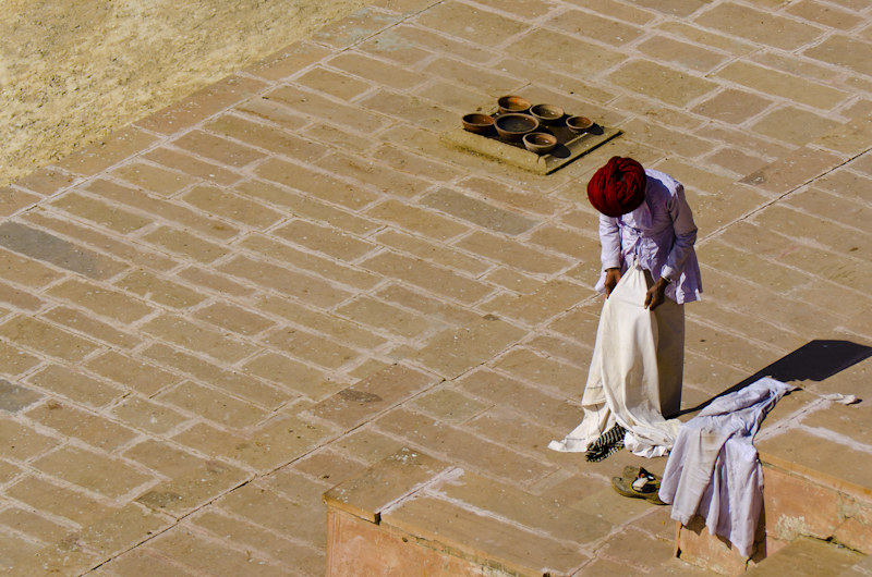
3. I think a much tighter crop on the man and the pots near his head. Other than that, there's a lot of empty space which isn't very interesting. I would try some careful selective saturation enhancements to bring out some of the colours.

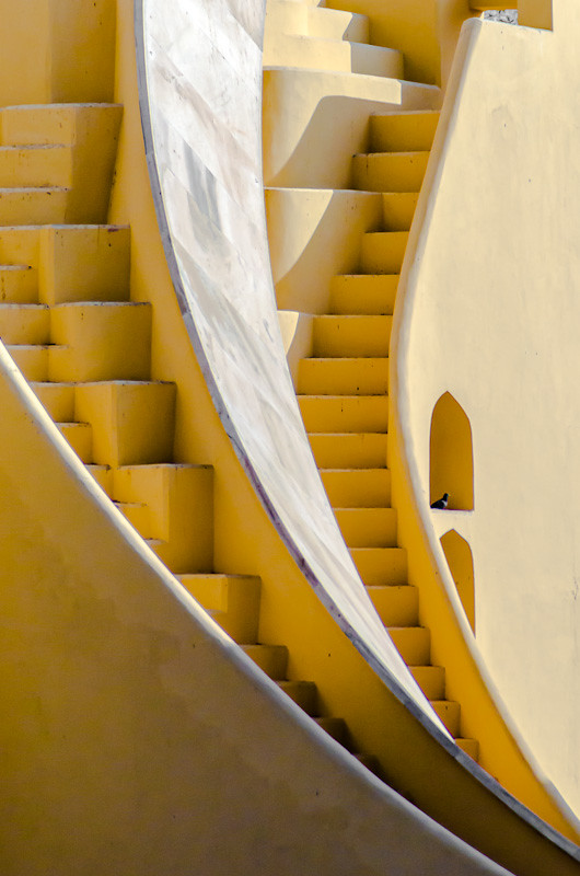
4. Great composition here, love the the image artistically, but the exposure kills it. You go from blown (or nearly blown) highlights in the top centre to deep shadow at the bottom. This one should have been reshot at a better time of day, OR toss a couple of speedlights into the mix to reduce the dynamic range. I think with some very careful dodging, burning and selective exposure enhancements this one can be turned into a good image.

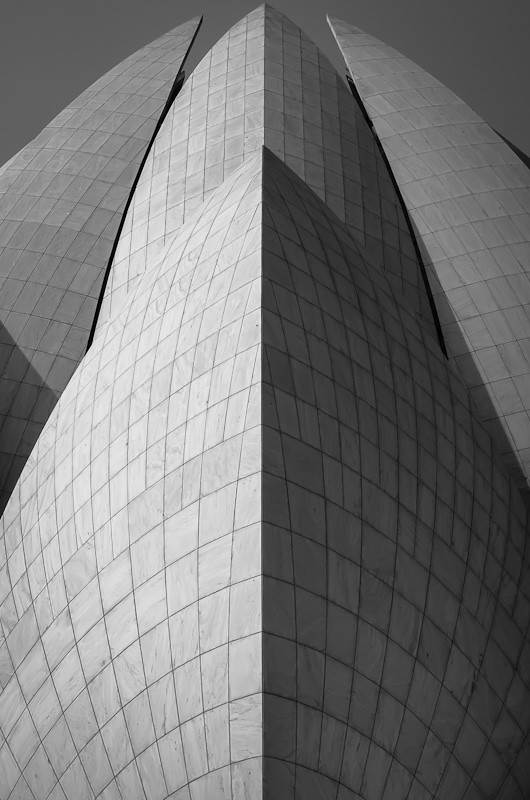
5. This one really says nothing to me. It's got some interesting patterns, but I think it needs a more "zingy" processing to make it interesting. As-is, I find it dull, flat and boring.

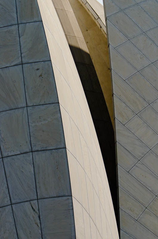
6. I like this - I think it would benefit from a contrast increase and some careful exposure enhancement. It's a shame that you've cropped the tops of the structure. I would try rebuilding that with the clone tool.

Overall, this isn't a bad set. You have some nice compositions, but the technical side of your work has a long way to go. My assessment of you would be that you are an artistic person, but lacking technical photographic knowledge. The good thing about that is that the technical side of photography can be learned. The artistic side is far more intuiative. Head down to the library and grab some books on basic photography and exposure and start reading.

Just my $00.02 worth - your mileage may vary.

~John
 
The abstracts are nice, and I think you've got some good ideas.

Try studying up on color management.


Thanks. Can you tell me what's wrong with the color management so I can have a place to start researching?


Just my opinion. . . but, if you are looking for photos that best describe you and your "eye" for photography, then I would think you would want to pick the photos that YOU think are your best (not our opinions).

Asking "what photos should I send to a professional" and "critique my work" are two very different questions.

The photos are nice, #4 looks blown out.

Yes, I agree. I did pick the photos that I like a lot and that I think she might, but since I'm so new I didn't want to embarrass myself sending pictures that I like that the rest of the world (or at least thephotoforum :) ) see as horrible.


I'm sure one of the other mods will be along shortly to move this to the correct forum (my work browser doesn't let me access all the admin tools or I would).

C&C per req:

1. I like the scene and the basic composition, but a few things come to mind. One is that the blues of the top of the pier are so bright as to be nearly blown, and the whites are blown. The other is that the sky is a bit insipid. The use of a graduated ND filter and a polarizing filter would have really helped this image. would consider cropping out the foreground shadow on the sand which will also move the horizon out of the centre of the image.

2. Holy under-exposure and cold WB Batman!!! To be honest, I'm not sure what the point of this image is. It's very cold, it's underexposed, and there's no discernable subject or purpose. I would reconsider this one.

3. I think a much tighter crop on the man and the pots near his head. Other than that, there's a lot of empty space which isn't very interesting. I would try some careful selective saturation enhancements to bring out some of the colours.

4. Great composition here, love the the image artistically, but the exposure kills it. You go from blown (or nearly blown) highlights in the top centre to deep shadow at the bottom. This one should have been reshot at a better time of day, OR toss a couple of speedlights into the mix to reduce the dynamic range. I think with some very careful dodging, burning and selective exposure enhancements this one can be turned into a good image.

5. This one really says nothing to me. It's got some interesting patterns, but I think it needs a more "zingy" processing to make it interesting. As-is, I find it dull, flat and boring.

6. I like this - I think it would benefit from a contrast increase and some careful exposure enhancement. It's a shame that you've cropped the tops of the structure. I would try rebuilding that with the clone tool.

Overall, this isn't a bad set. You have some nice compositions, but the technical side of your work has a long way to go. My assessment of you would be that you are an artistic person, but lacking technical photographic knowledge. The good thing about that is that the technical side of photography can be learned. The artistic side is far more intuiative. Head down to the library and grab some books on basic photography and exposure and start reading.

Just my $00.02 worth - your mileage may vary.

~John

Thank you for your comments! I think I will try to re-edit them and see if I can improve them with your comments in mind. I think you are right about the technical side. I have a long history with art (15+ years drawing and illustration) and a short (6 months) history with photography. Soo...I will keep shooting. But if you have time, maybe check back and see the new edits. One specific question about #2--Does the fact that the wall was *actually* intensely blue (and a side note the wall of the stairways was actually yellow...buildings in India have weird colors...) make a difference with the white balance problem? Walking in the restaurant was like a kick in the eyes with blue and that's why I thought it was so interesting. But I guess if people's first instinct is that it's a terribly edited photo then it doesn't matter what it actually was... Thanks again!

And also, a general question about exposure--if the histogram does not have any peaks "climbing the walls" on either side, can it still be a terrible exposure? If it does can it be a great exposure?

Thanks so much, everyone! :) :)
 
Last edited:
Ok, so I've gone back and re-edited four of them. Uhh most of the clipped highlights/shadows were recoverable which I guess means when I edited the photos before I was terrible at editing. Hopefully I've gotten better. I would love to hear feedback on the updated photos!
Thanks so much!

1.
7570653706_8e544983b2_b.jpg


3.
7570652380_2114668e14_b.jpg


4.
7570650852_7abd3428a1_b.jpg


6.
7570649674_5cbd65ec82_b.jpg


7.
7570806912_5b71452d4c_b.jpg

Found another that perhaps is better than 2, 5 in the first post...
 
Last edited:
#1: the colors have come out well after edit
#2: I liked it, because it looks like a drama house; as Tirediron has pointed out the blue is too blue here; i thought of an edit, if you don't mind....


#3: i always admire this kind of image...i have seen many images from Rajastan with this kind of style; of course i would prefer him not so much towards the edge and instead would zoom out to get a better "high from sky view pioint' feeling
#4 is awesome
#5: is OK
#6: is good
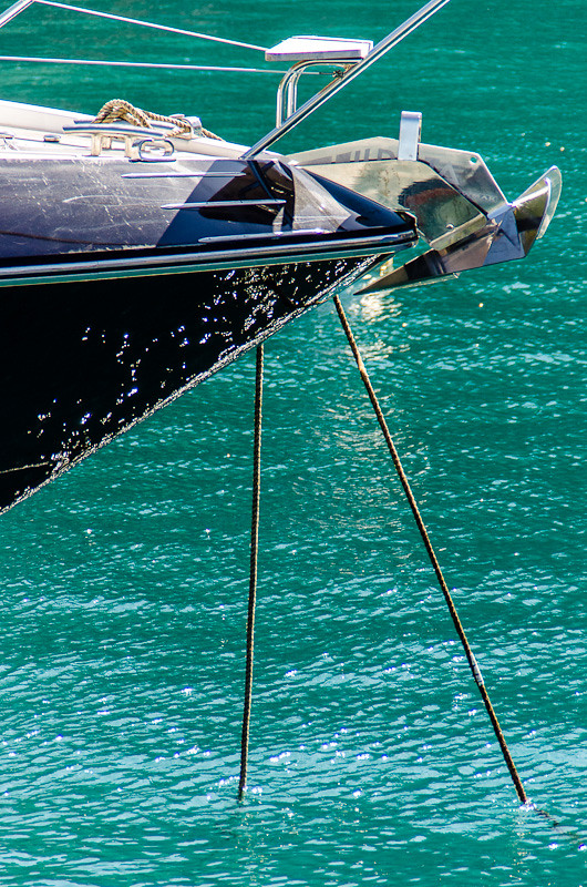
The entry of ship end is very attractive... i liked the deep green color of water very much

Regards :D

@Tirediron: Kindly copy the images as a whole and comment in between so that one can read and verify the points easily :D:D

Thank you

:D
 
Thank you for your comments! I think I will try to re-edit them and see if I can improve them with your comments in mind. I think you are right about the technical side. I have a long history with art (15+ years drawing and illustration) and a short (6 months) history with photography. Soo...I will keep shooting. But if you have time, maybe check back and see the new edits. One specific question about #2--Does the fact that the wall was *actually* intensely blue (and a side note the wall of the stairways was actually yellow...buildings in India have weird colors...) make a difference with the white balance problem? Walking in the restaurant was like a kick in the eyes with blue and that's why I thought it was so interesting. But I guess if people's first instinct is that it's a terribly edited photo then it doesn't matter what it actually was... Thanks again!
Look at the girl's skin tones in the image you posted. Not what you have at home but the one that you posted since that is the one we are looking at. Did her forehead really have that bluish / magenta tint to it? Look at the edges of the pages of the book she is reading. Also a magenta tint to them. It could be that the light reflecting from that wall actually did give everything that bluish tint but just looking at the shot there is nothing there that even comes close to being true white or even neutral gray. You were there, you saw the scene so you tell us: Is that the way you saw it?
 
The second edit of the #1 completely ruined it. The first version wasn't technically perfect, but it had visual pop and successfully de-emphasized the weird and crummy looking plastic of the pier.

#2 is magificent. Possibly very minor tweaks of color balance would improve it, I suppose. The girl's expression, and the space she's in, are terrific. The cold tones are a) probably pretty close to the way it looks and b) perfect to go with the girl's expression. Sure it's a little dim, it's clearly a shadowed courtyard, it's supposed to be a little dim. The light is obviously pretty close to right, look at the brightly lit objects (jars?) at the top of the frame (note: there are some JPEG artifacts on here, but that could easily be this site, not your fault)

The second edit of #3 also ruined it. Tirediron, with all due respect, is completely wrong. The original is all about negative space and textures, giving an abstracted context to the guy. The edit is just some picture of a guy in a turban.

Your edit of #4 is a substantial improvement, except that the objects set on the flat area upper right are de-emphasized, and I think that symmetry-breaking is what makes this image.

#5 and #6 are not my cup of tea. They're pretty good examples of the thing they are, I think. Contrast here is entirely subjective, since these are abstracts. There is no reality to respect, here, so do whatever makes you think they look good, whatever you think best conveys whatever you intend to convey.

#7 isn't much of anything. It's too busy to be a successful abstract, there doesn't seem to be any particularly fortuitous arrangement of forms. It's just some shiny junk heaped in a frame. Given #1 through #6 as originally shown, I am frankly surprised that you would bother with this one -- you have a fine grasp of form and texture, which is completely lacking in #7.
 
You did a better job. I like the edited ones. Wish I was at the ocean, it looks so beautiful.
 
Thank you for your new feedback. Yes, I guess photography and aesthetics are very subjective so it's no surprise there might be disagreements. Anyway, thanks to everyone for your comments and suggestions for improvement and occasionally the defense of my vision. It's all very helpful and I have a much better idea now of what some other people "in the know" think of the photos.
 

Create an account or login to comment

You must be a member in order to leave a comment

Create account

Create an account on our community. It's easy!

Log in

Already have an account? Log in here.

Back
Top Bottom