Chatsworth House, Derbyshire

theraven

No longer a newbie, moving up!
Joined
Oct 16, 2012
Messages
677
Reaction score
102
Location
Stoke on Trent, Staffordshire, UK
Website
www.ravenphotography.co.uk
Can others edit my Photos
Photos OK to edit
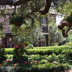
I think this photo should have been shot a little more to the left, however I quite like how it is centered on the corner of the building with a different angle looking down each side. Just looking for different opinions on this?


Chatsworth House by ravenphotography2012, on Flickr
 
There are much better views of Chatsworth.

Thank you for your in depth, forensic analysis of my photograph, along with the paragraphs of critique. I must say, if I wanted a postcard picture, I'd buy one from the gift shop!

This is an angle that I liked.
 
theraven said:
Thank you for your in depth, forensic analysis of my photograph, along with the paragraphs of critique. I must say, if I wanted a postcard picture, I'd buy one from the gift shop!

This is an angle that I liked.

Well i don't like the angle or vignette its ok as a memory of being there
 
i would have stepped back to see if there are any lead in lines, the way you have shot it my eyes go to the corner then left or right straight out of the photo
 
That was the point, I wanted an equal view of both sides of the building, I didn't want more of a focal point on one side pulling the eyes down one side and not the other. If your looking left and right then that is what I was looking for.
 
theraven said:
That was the point, I wanted an equal view of both sides of the building, I didn't want more of a focal point on one side pulling the eyes down one side and not the other. If your looking left and right then that is what I was looking for.

Trouble is i look down one side and think is that it nothing grabs me
 
Well at the end of the day it is a photography of a house, the architecture is nice, the detail is good, but there isn't anything in this photograph that should capture you, just appreciate the lines , the angles and the details.
 
a tad dark for me. I think I would have liked to see the bottom, front, corner in the frame.

View attachment 23285
 
Last edited:
seems very slightly tilted to the right. Vignette is way too much. I don't understand the framing. There ends up being empty space to the left, but the right is cut off arbitrarily, as is the bottom of the frame. The dark featureless sky is a bit off-putting.

If you wanted a centered corner, it would have been much better to move such that both sides of the building are equal on the sides of the frame.

A centered subject can work, but it tends to need symmetry to be pulled off. Visually this photo just seems unbalanced. There's nothing on the left to balance the building running out of the right side of the image. The cut off base is unbalanced visually by the dark, featureless sky above.

I'm sure you had intent when you took the photo, but the intent is not communicated to the viewer. To the viewer the framing just seems arbitrary. It's okay to break certain 'rules' but you should have a reason for doing so.

You said you want us looking left and right, which is fine, but I think you missed that we are looking left and right to try to find something of interest. The framing seems to indicate that something important should be in the bottom left of the frame, but there isn't.
 
I don't particularly mind that the building runs off the right side of the frame but not the left. Particularly for large buildings (mansions, factories, etc) this can embellish the feeling of the immensity of the building, that it just...keeps...going. What does bother me is that you've cut off details on the bottom. You've cut off the foundation on the corner and the stairs on the left side. These are features which the viewer instinctively knows go to the ground, which we can tell is not far out of frame, so cutting here feels arbitrary.
 

Most reactions

Back
Top