abovenormphotos
No longer a newbie, moving up!
- Joined
- Jan 17, 2014
- Messages
- 149
- Reaction score
- 40
Hello everyone!
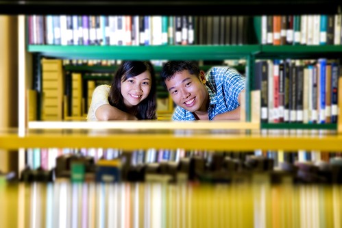
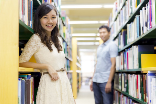
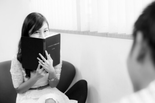
I was recently asked by my friend to take some photos of them at the Library where they first met so that they would have a collection of photos which they can use during their wedding reception. I jumped at the opportunity to do so. Here are some of the pictures taken.
I am extremely interested in the nuances of taking and producing good photos and I truly hope that I can learn from all your critique. I am not a professional photographer and I am not getting paid for this, but I truly love photography and everything related to it. Right from the set-up to the post-production. This is why I wanna do all that I can to get things right. I am a big fan of this forum and I hope you guys can drop by and offer some pointers so that I can improve.
Photos taken with Canon 6D, Tamron 24-70 VC, Off camera flash, Reflector.
Looking forward to hearing your thoughts!
Best regards,
Norman.
Singapore
XL and JY Casual Shoot.
#1 -
 XL & JY Casual by AboveNorm, on Flickr
#2 -
 XL & JY Casual by AboveNorm, on Flickr
#3 -
 XL & JY Casual by AboveNorm, on Flickr
#4 -
 XL & JY Casual by AboveNorm, on Flickr
I was recently asked by my friend to take some photos of them at the Library where they first met so that they would have a collection of photos which they can use during their wedding reception. I jumped at the opportunity to do so. Here are some of the pictures taken.
I am extremely interested in the nuances of taking and producing good photos and I truly hope that I can learn from all your critique. I am not a professional photographer and I am not getting paid for this, but I truly love photography and everything related to it. Right from the set-up to the post-production. This is why I wanna do all that I can to get things right. I am a big fan of this forum and I hope you guys can drop by and offer some pointers so that I can improve.
Photos taken with Canon 6D, Tamron 24-70 VC, Off camera flash, Reflector.
Looking forward to hearing your thoughts!
Best regards,
Norman.
Singapore
XL and JY Casual Shoot.
#1 -
XL & JY Casual by AboveNorm, on Flickr#2 -
XL & JY Casual by AboveNorm, on Flickr#3 -
XL & JY Casual by AboveNorm, on Flickr#4 -
XL & JY Casual by AboveNorm, on Flickr")