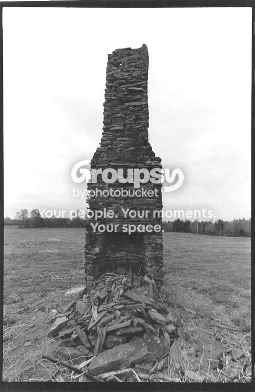
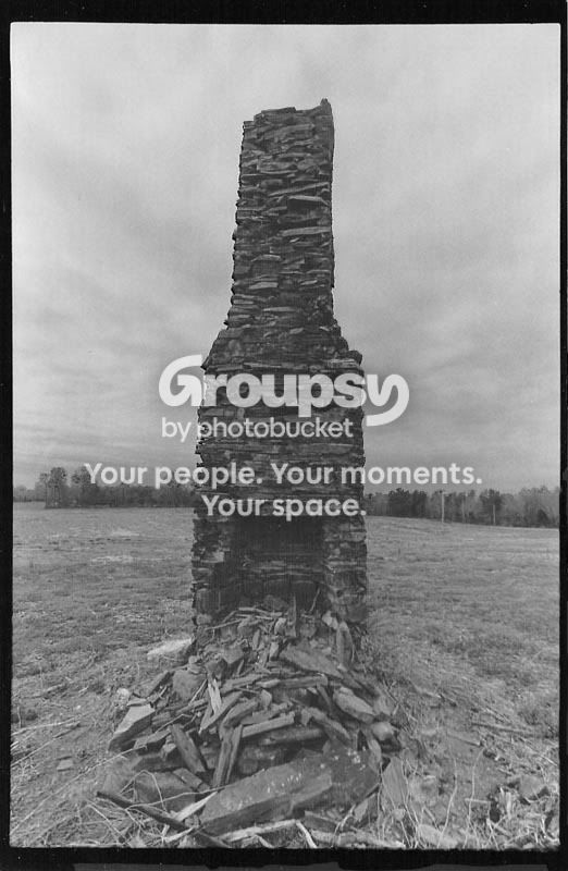
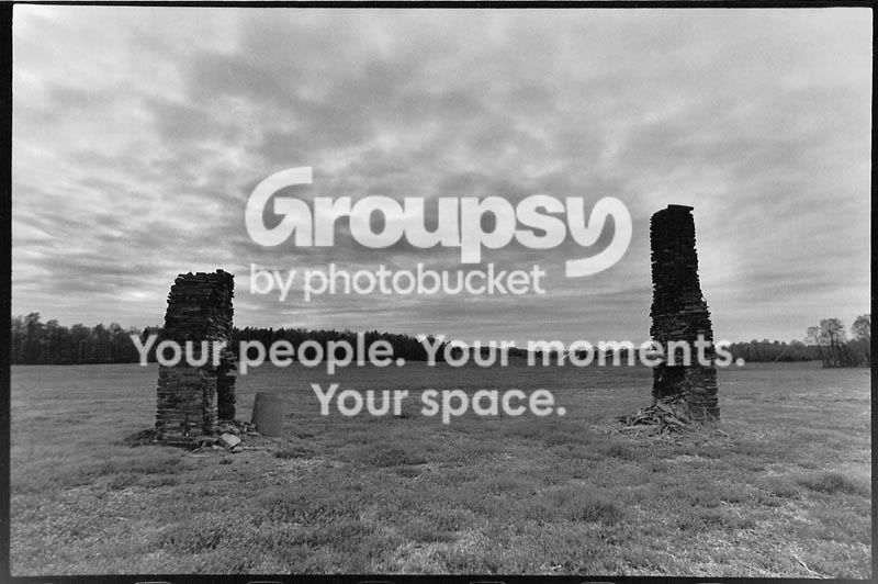
These chimneys have a lot of character. And you have some yummy grain going on here, too.
Some areas of the chimneys are a little muddied, however. The sky is terrific looking in print #1 (your second try), but you need more contrast on the chimney itself. Hit that baby with higher contrast, then cover it with a dodging tool while you burn the sky in the same way you did before. Otherwise, you end up with a flat-looking image like this.
Hold the chimneys back the same way in the second print - you've allowed too much exposure on them, which is great for the sky, but has turned the tops of the chimneys black, and we miss their character shining through.

You have to find the perfect combination to pull the chimneys "out" of that sky.
Brighteyesphotos is on the right track by the mention of split contrast printing; what I would offer up is for you to explore
split grade printing. This link is to a brief article by Les McLean, an excellent photographer and superb printer. It's a pretty basic tutorial but it will help you in your approach to these negatives.
Just another way to think about printing. It's fascinating and frustrating at times, isn't it?

These are good shots - stick with it! :thumbup:










![[No title]](/data/xfmg/thumbnail/39/39532-073f9eb14e26e2b99cc29112b92a2ab6.jpg?1734173679)