What's new

Pastels and Watercolors (and a few other art media)

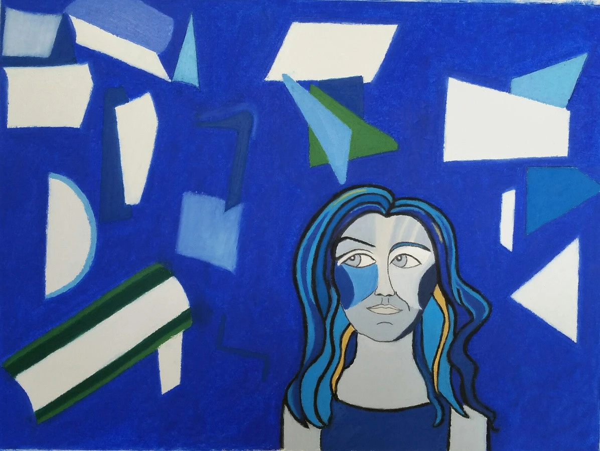
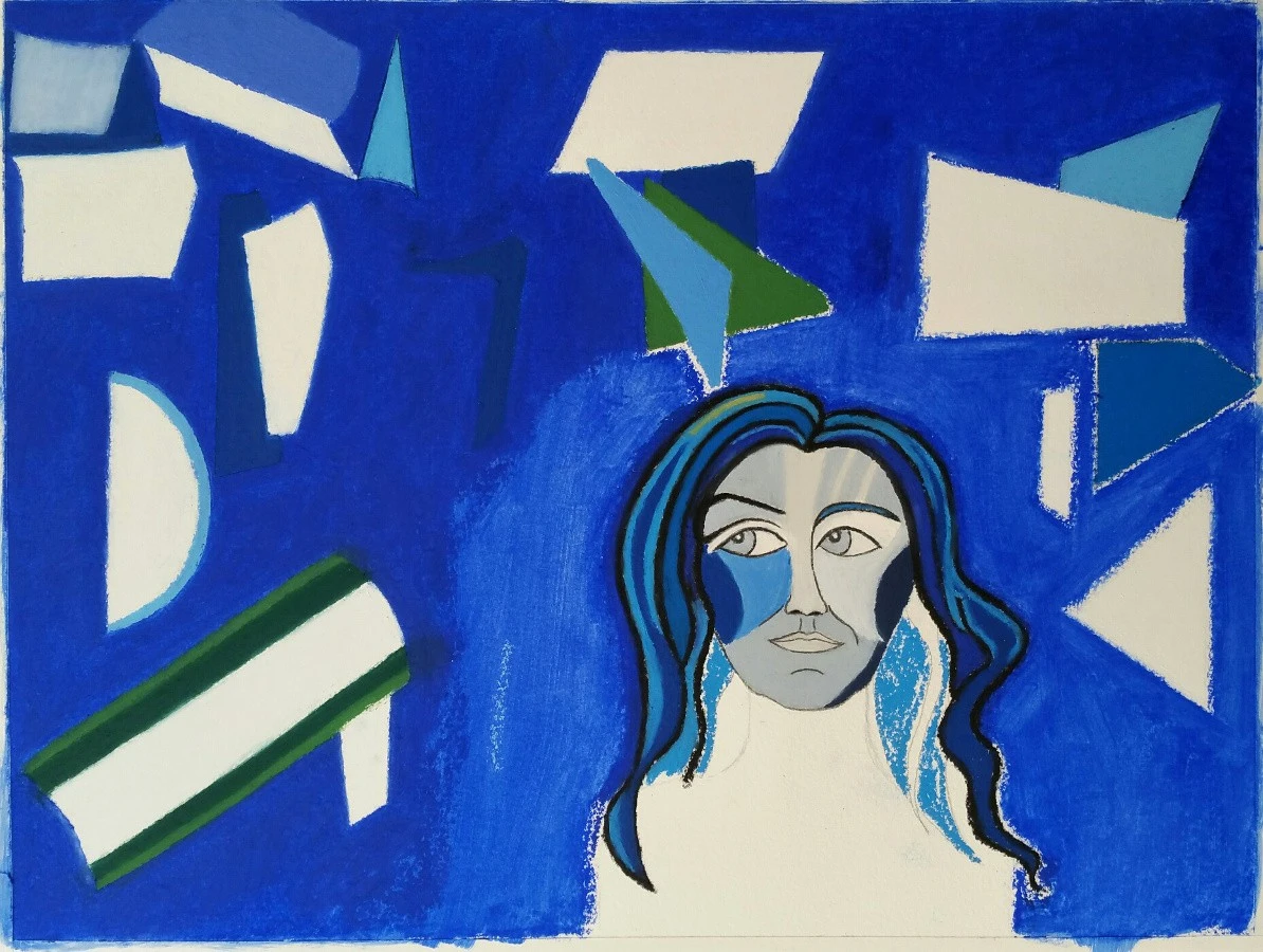
This is what I've been working on. I've been a little obsessed with vivid blues, a la Marc Chagall and others. Ultramarine blue, cobalt blue, blue! We were chatting here the other day about papers, finding suitable, inexpensive papers, so I made a very loose sketch of rectangles, folds, and various geometric shapes, with a portrait of me in the corner. 12 x 16" Arches oil paper this time.

Study in Blue, sketch.webp


It doesn't make much sense, really. :blush: But I went with it, adding in colors (blues!):
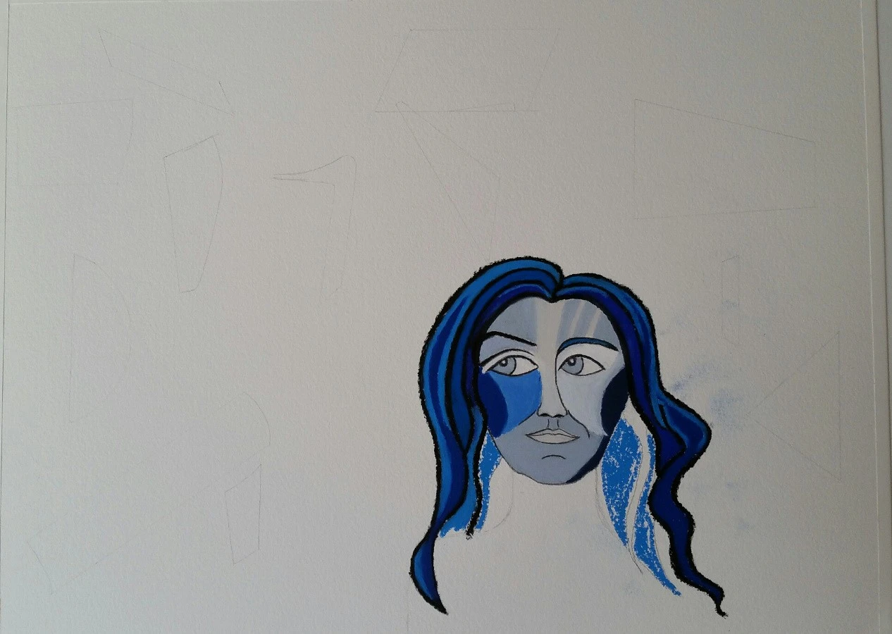
Study in Blue, wip 2.webp


To fill in the background around the shapes, it was faster to just lay the oil pastel on its side and scumble it all around:
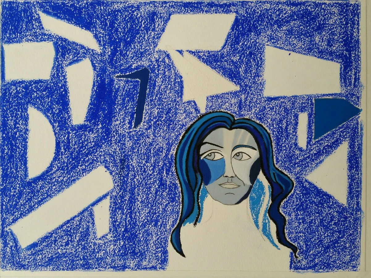
Study in Blue, wip 3.webp


Then I used a brush and blended it all in with Turpenoid (odorless turpentine, artist's grade), so I could easily color over it and start filling in the shapes:
Study in Blue, wip 4.webp


Here is the final painting:

Study in Blue 1.webp


This was fun! It got pretty messy at the end, though. Somehow a small piece of this ultramarine oil pastel got on my ankle, and I smeared it into the couch when I finally sat down and curled up. oops. :lol: It came up easily with fabric cleaner, but I was tired by then. I used Marshall photo oil pencils around the eyes and face, the thick lines are oil pastels.
 
Fanfreakintastic!
 
:lol: Thank you!
 
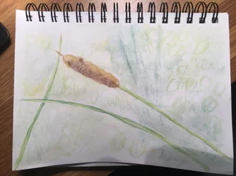
The only sketching were a general "bulb" for the cattail, and lines for the stem and grass blades. I want to put some more pencil down to add a little depth.

1. Laying down the pencil.
View attachment 194793

2. Water washing.
View attachment 194794
Looks great!! I love the clearly defined cattail, stems, and leaves with the soft background. Really helps with separation.

I’ve wondered about the watercolor pencils. Do you think they’re easier to work with compared to watercolor alone? I tend to have a heavy hand and like super bright colors (especially as of lately, see Fallingwater lol).

One thing I would like to start doing more is play around with layering in watercolor. How do pencil work with layering?

Also, super side question: how do you store loose leaf paper that you use with fountain pens/etc? I bought some Tomoe River paper; as I use the paper, I’m trying to figure out how to store it. I’m thinking of a photo box.
 
Thanks, Wade!
 
  • Thread Starter 🔹
  • Moderator 🛠️
  • #472
Gorgeous, Terri.

As far as the WC pencils, I put down a light coat of color. It's much easier to add more than to take it out without smearing a lot.

edit: I wrote this last night, but for some reason, didn't hit the Post button.
 
  • Thread Starter 🔹
  • Moderator 🛠️
  • #473
Wade, I would't use "easier" but "convenient." You only have to sharpen them, draw and color, then use a water wash. I like them for small works - 5x7 up to 8x10, and for short trips. I did a small landscape (road and mountains) last year, sitting in the hotel lobby when I when went to Orvis-land, VT. I wouldn't try anything larger with the pencils. I also think I can get finer detail with the pencils, though you can get a super-fine line with a rigger brush. I have learned to use a lighter touch and I'm trying to do wc with two or three layers, rather than a single heavy layer. With the pencils, I'm waiting for the first wash to dry, then go back and color over the wash. We'll see how it does today.

I think pans are more convenient than tubes, but I think tubes will last a whole lot longer than a half-pan.

For the paper, a photo box sounds like it would work fine. I have this drawer unit from Ikea that can store up to about 16x22, which is fine for most of my pads and books. I slide the larger items in between the cabinet and table legs. MLW's uncle make me a cabinet that will hold the larger items, but due to space being lost by the new home office, I had t put it in storage for a while.

 
I really like the looks of that Ikea unit. I'm currently just letting my oil pastel things air dry for a few weeks, then a finishing spray and a sheet of waxed paper in between them.

But they're left standing up, and I wonder if the paper could develop a permanent curve or bend. I'm not sure what option is best. Ideally, I should get them all dry mounted, but eww. :lol:

Edit: Oh, and thank you for the kind words on my painting, Charlie! :)
 
I learned how to dry mount using the big press at the local college darkroom. But... now I'd be more inclined to let someone else do it! and I'll pay them! I do have a tacking iron, I could do that much then mat and frame.

You're doing some really cool and interesting work Terri.

I was supposed to learn to do florals with the water soluble color pencils, but... the class was from the Royal School of Needlework and me and another participant in the US thought it was on EDT like the other session that had filled up... but it wasn't, turned out the one we registered for was on Greenwich Mean Time (or some such thing!). This is all new for them and they hadn't realized the time wasn't clear on what time zone and where in the world it was!

So I have yet to get back to experimenting with the pencils using them with water. At least I got in on enough of the class to know how to draw florals to be able to use them as embroidery patterns, as that was the point of the class. The most I've done is some Limerick lace making and did my own rose pattern, and that's as far as I got with that (so far anyway).

Next week I'm taking a real class, none of my usual messing around. It's thru the local university (with a no credit option, don't need those grad credits anymore!). On print making, which I did somewhere along the way but it's been a long time and was in school and/or with kids or something, so for this, I have to really ya know, follow a syllabus and do a project... I mostly need to get it together on a Monday morning! not used to that anymore.

edit - And a box came from Jerry's Artarama!
 
Last edited:
  • Thread Starter 🔹
  • Moderator 🛠️
  • #476
So I added a little more of the dark green to try and bring out that darker area in the background, and a little more definition in the grass blades. I also went in with come circles in the background to see if I could get close to the bokeh balls, and added a little more of the darker brown on the cattail bulb. I'm calling it done. I could still do more in the background but I like the way it has turned out.

IMG_E1453.webp
 

Attachments

  • IMG_E1447.webp
    IMG_E1447.webp
    1,022.7 KB · Views: 86
Last edited:
Oh Wade you did not really paint over that nice sketch you did... That was so nice, with a little more work on it you could've had such a good drawing. I saw potential in it that I guess you didn't see. I think you have ability and talent, and much of what you've shared is close to being really good with more practice, taking an art class sometime would probably be worth it.

edit - What I see looking again is that the pencil sketch could use more definition, and there's empty space. In the color version, there's so much of the same blue. Cover up the building and just look at the bottom half; I think in the painted version that's where it appears as shape without shadow, dark, light, etc. I don't see where it changes from grass to sky. The marks to indicate grasses could be further defined and seem to be the same size; it should vary closer to the building compared to what's closer to the viewer. That's where taking a class could teach perspective and how to use that in drawings and paintings (at least I remember learning that in art classes).
 
Last edited:
Charlie that's really nice.

Thanks for sharing the progression; it gives me some idea what to do with these water soluble pencils that have been sitting here for a couple of weeks. (As well as the other box I found the other day after of course I bought a new set of pencils when I couldn't find the first set I'd bought...).
 
Oh Wade you did not really paint over that nice sketch you did... That was so nice, with a little more work on it you could've had such a good drawing. I saw potential in it that I guess you didn't see. I think you have ability and talent, and much of what you've shared is close to being really good with more practice, taking an art class sometime would probably be worth it.

edit - What I see looking again is that the pencil sketch could use more definition, and there's empty space. In the color version, there's so much of the same blue. Cover up the building and just look at the bottom half; I think in the painted version that's where it appears as shape without shadow, dark, light, etc. I don't see where it changes from grass to sky. The marks to indicate grasses could be further defined and seem to be the same size; it should vary closer to the building compared to what's closer to the viewer. That's where taking a class could teach perspective and how to use that in drawings and paintings (at least I remember learning that in art classes).

Art is very personal and subject to the artist’s vision. Sharing things that you’ve created is hard enough without having someone give a lot of unsolicited critique. I’m sure you mean well but this came across as harsh.
 
So I added a little more of the dark green to try and bring out that darker area in the background, and a little more definition in the grass blades. I also went in with come circles in the background to see if I could get close to the bokeh balls, and added a little more of the darker brown on the cattail bulb. I'm calling it done. I could still do more in the background but I like the way it has turned out.

View attachment 194913
Wow!! Very impressive. It's amazing how much depth you added. I especially like the darker brown under the cattail bulb, the deeper greens. It just pops now.

I liked it before, but you've really elevated it. Great job.
 

Create an account or login to comment

You must be a member in order to leave a comment

Create account

Create an account on our community. It's easy!

Log in

Already have an account? Log in here.

Back
Top Bottom