
GeorgieGirl
No longer a newbie, moving up!
- Joined
- Nov 5, 2010
- Messages
- 2,469
- Reaction score
- 325
- Can others edit my Photos
- Photos NOT OK to edit
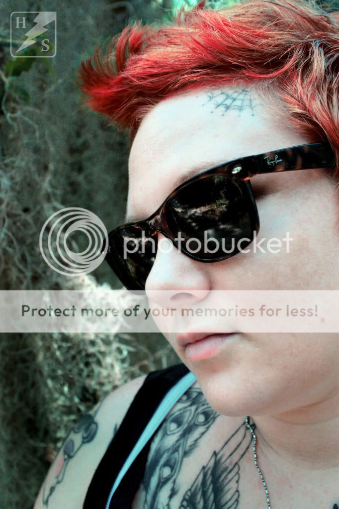
It appears to me with both photos you have presented that you are working on a theme/technique that is a style for you. I see what you accomplished in your first photo with the selective colorization and the muting of all the other colors down to about a pinkish tone. I see the same what I am going to call muddy-ing in this one. I like the composition of this second one better than the first, I'm not a fan of the colorization and I can't say why other than I don't think it is enhancing your wife in either shot. Bur for the second one, I'd try some selective colorization on her lips for fun. I did like the blue of the glasses on the first.
So my question to you is what is it that you are going for with your style of processing? Are you happy with the base colors that you have created, and why? And how do you want your photos to look when you are done with them...do you think you are there with it.
So my question to you is what is it that you are going for with your style of processing? Are you happy with the base colors that you have created, and why? And how do you want your photos to look when you are done with them...do you think you are there with it.


![[No title]](/data/xfmg/thumbnail/32/32160-4e45e524b050f1afae9fd21bf696d61b.jpg?1619735234)
![[No title]](/data/xfmg/thumbnail/35/35871-d9de705fa64b06051419be6d3739d6ac.jpg?1619737197)
![[No title]](/data/xfmg/thumbnail/32/32158-8de1a90710a58144b47a0cee83a6c820.jpg?1619735234)