Portrait of a Skater

JamesRPhoto

TPF Noob!
Joined
May 1, 2012
Messages
45
Reaction score
5
Location
Regina, SK, Canada
Can others edit my Photos
Photos NOT OK to edit
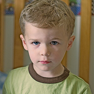
A friend of mine called me a few weeks ago to do some skate photos for his team at a local skate park, as I was leaving I figured I'd do a quick portrait. All natural light and some creative processing work.

brady-fb.jpg
 
Very nice. I like the brightness of the shirt (ironically subway layout) against the natural backdrop.
 
Have you thought of cropping this? Try a very tight crop in portrait format. Lose the extra person, the tree, and the bottom of his shirt.
 
No, the environmental element is a huge part of my style, and IMO without the other person with a skateboard, he's just a guy standing in a park. Boring "just a guy standing there" portraits are not my thing.
 
I like it with the background....it gives it the situational persepective
 
IMO, you can't really tell that this is a "skate" setting. He's not standing in a skatepark, he's not holding a skateboard, he's not wearing a helmet. The only connection that you have with it being a "skate" scenario is the fact that there's an out of focus guy that MIGHT be holding a skateboard in the background. But honestly, I wouldn't have known that if you hadn't said anything. To me, he looks like an unenthusiastic youth standing on a street on an overcast day.

You could loose a lot of the space on the right, which doesn't add anything to the photo; whilst still maintaining the figure in the background. It would also lessen the obvious tilt of the horizon as it tapers off towards the edge of the frame. The vignette is a bit heavy for my taste, but that's more up to your artistic interpretation.

The photo is nice and sharp though, and I do like the way the subway map pops on his shirt. You did a good job with that.
 
That is indeed a skate park, and the person behind him has a skateboard, the cut out sculptures in the background also depict a skate set, the point in my work isn't to necessarily put everything out in the open so the concept can be discovered at a glance, I enjoy photos that gradually allow the viewer to discover concepts as they view it longer. I appreciate your take on it however I don't think that's how I would have shot it.
 
I understand where you are coming from in the respect that you don't want everything to be laid out for immediate discovery... But there needs to be more supporting elements especially if you're into commercial photography. You have to be able to see the image as a disconnected viewer. Expect the viewer to NOT immediately be told the context. The sculpture you speak of could be literally any art installation around a town or city, there's nothing about it that says "skatepark" to me, and it's partially covered by a tree which further negates the context you are speaking of.

I know you can TELL me that it's a skatepark, but contextually all I see is the curb on a curved road and someone crossing it. You yourself said that you like to make images where the setting doesn't need to be spelled out. If there were kicker jumps or a half pipe it would be somewhat obvious. I see you're only 19, and I am just trying to give you some helpful tips for the future. I was 19 once, and also thought that I was infallible and that my work was not worthy of critique. I soon learned otherwise and started adopting some of what people suggested. Your other work indicates that you have talent with a camera, but this photo needs some work if you want to actually follow through with a cohesive vision.

I was presented with a commercial project that involved promoting a web design company that practices all of the "web standards," as well as makes all of their websites view-able and 100% usable on iOS devices. The goal of the image was to give the viewer the idea that they were looking at a website on their mobile device in a museum or art gallery setting because the company does specifically art gallery, or museum sites. I chose to utilize a shallow depth of field with a long focal length to appropriately blur the works of art, but more specifically draw attention to the subject holding the iPad. There is no doubt that there is a person in front of works of art hanging from a wall, and they are using an iPad to view a website constructed by the company. The image can be viewed here: plein air interactive: Website design, mobile app development and online marketing strategy for museums
I also supplied the image in the gutter of the page that coincided with their vision to be "light and airy."

I posted a thread on here with the images before they were finalized and received a lot of positive critique, even with the way the image was. I still changed things, but I got a foundation for what the image should be. If you're interested in seeing the thread I'd be more than happy to link you.

I look forward to seeing more of your work, and this post was not meant to discourage you in the least. Hopefully you will become more receptive to critique and be willing to experiment with your images in the future. Keep shooting!
 
I've been in the game for a while now, to me it seems like you're assuming I'm new to photography, I apologize if this is a wrong assumption. I've been taking critique on my photography and have been involved in quite a few different photography forums and clubs in the past 5 years, and have come to realize that not everyone will understand the style I create my work in, and I shouldn't take every piece of advice to create a more technically sound image that doesn't convey the feel that I enjoy and get from the work I've done. I take critique on what makes sense to me, and if there's something that you'd do differently, then that's fine, you just aren't part of my audience and I don't expect everyone to be.

I currently hold a staff position at a design studio doing what you described your work to be, and I understand all to well the need for a technically sound and simplistic image to advertise a product and convey a certain message, however when I'm doing a shoot for pure artistic enjoyment, these rules need not apply and I find more joy in exploring alternative representations of an image.
 
No, the environmental element is a huge part of my style, and IMO without the other person with a skateboard, he's just a guy standing in a park. Boring "just a guy standing there" portraits are not my thing.

Did you want C&C? You don't seem to be too receptive and appear to rebuke the critiscm given. I will give you my opinion here; The subject has character but other than that the image lacks any interest to me. I also don't see skatepark. The background doesn't add to this image, it's not horizontal and feels 'uncomfortable'. I look at your image and I see a guy standing in the park, but hey, that's just my opinion :)
 
Ya GOTTA' get rid of that telephone pole in the background on the right-hand side of the frame...that simply MUST go!
 
Not especially no, I'm used to forums having a section for photo sharing and a separate section for C&C, is this not the case here? My work is my style and that's not going to change, when I hit save I've completed all that the image is and will ever be, this one in particular has been featured in a "suburban portrait" gallery and won a local award for environmental portraiture. I don't necessarily come on here to improve myself, moreso to share what I'm doing. Every element in each photo is left to provoke a certain feeling for a certain audience, if it does nothing for this audience then so be it.
 
A gallery for sharing photos of the people in your life, from informal portraits & candids, to your home studio shots or street photography. Post for discussion and feedback, including general critique.


You should really take this C&C to heart. You can improve your skills and its not really a "style" that's wrong with your shots. There are things in your photo that are distracting and take away from what it is. Things like the uneven horizon. If it was an obvious tilt, it would be more obvious. It looks like you just did that on accident. I think it could look better with the guy holding a skateboard. Don't cut people off at the joints. I think you should either show more of him vertically (including feet) or show less of his shirt. Also as Derrel said, that telephone pole is distracting.
 
Not especially no, I'm used to forums having a section for photo sharing and a separate section for C&C, is this not the case here? My work is my style and that's not going to change, when I hit save I've completed all that the image is and will ever be, this one in particular has been featured in a "suburban portrait" gallery and won a local award for environmental portraiture. I don't necessarily come on here to improve myself, moreso to share what I'm doing. Every element in each photo is left to provoke a certain feeling for a certain audience, if it does nothing for this audience then so be it.

While I can respect your intentions you give off an air of arrogance in that you know exactly what you are doing and have attained the pinnicle of photography....which you have not. If you are not here to learn from citique of your peers then perhaps you are in the wrong house. ;)
 
All that dead, brown grass, and all that downhill tilt on the right hand side of the frame....Ugh!

Hold your hand up to the screen and cover up the entire right 1/3 of the frame...the photo then has at least "some" focus on the zit-faced skater in the foreground. The dead grass and the white pieces of trash, the telephone pole, and the pond, and the crooked horizon...man...all of those elements are extraneous. If you were Mary Ellen Mark, I could see this kind of shot. if you were showing us something interesting besides dead grass and garbage, I could understand your defense of your "choices". I would, if you were Mary Ellen Mark, assume that you had actually MADE cognitive choices; looking at this image, I have the feeling that all you did was aim the camera and mash the shutter button. If you are trying to emulate the studied unstudied type of photography practiced by masters with two to five decades of experience, you have missed the mark. I KNOW the style you are trying to pull off...and you are not yet showing us that you can succeed.

A little tip: if you wanna be artsy-fartsy, B&W would help. A LOT. If you wanna see if your composition sucks or is solid, try a B&W conversion. If you wanna see if your composition is weak, try flipping the image upside-down and studying it.
 

Most reactions

New Topics

Back
Top