JamesRPhoto
TPF Noob!
- Joined
- May 1, 2012
- Messages
- 45
- Reaction score
- 5
- Location
- Regina, SK, Canada
- Can others edit my Photos
- Photos NOT OK to edit
I very much appreciate that you're trying to help me but I have to disagree that those suggestions would improve the photograph, I apologize if it comes across as arrogance, but that's just how I feel. There are a lot of photos taken by top photographers in their respective industry that have components that I would change to make it more appealing to me, but ultimately it's their creative discression and their feel of the photograph that's earned them the reputation they have, and I myself have come further in my industry and become a lot happier as an artist since I stopped doing what didn't make sense to me, in order to appeal to others. Again, I don't mean any arrogance or defensiveness, that's just my philosophy on the matter and I don't know how to say it nicer than that.


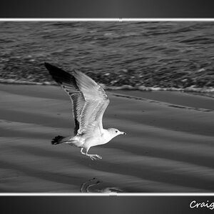
![[No title]](/data/xfmg/thumbnail/37/37657-01deca3769b38b716838942ccbfce66a.jpg?1619738172)
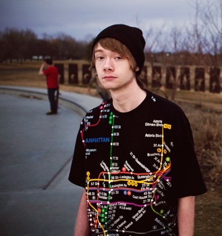
![[No title]](/data/xfmg/thumbnail/37/37658-89245697846ece2c4ecbce304510699b.jpg?1619738173)
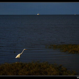
![[No title]](/data/xfmg/thumbnail/37/37636-e02c7efccb426a8951ed97a37c0f9307.jpg?1619738157)