Rule of Thirds C & C

linpelk

TPF Noob!
Joined
Jan 1, 2009
Messages
406
Reaction score
0
Location
California
Can others edit my Photos
Photos OK to edit
So I thought this week's group 1 assignment would be easy. It's just the simple, basic "Rule of Thirds". Well I found something out about myself this past week..I most often shoot VERY close up, filling the frame with my subject. It has been a challenge for me to step back. Especially since I've determined that my 24-105m is shooting soft and I can't stand it!! I screw up the focus enough on my own, I certainly don't need the lens to help contribute to this. So these past few days I've JUST been shooting with my 50mm f/1.8. This has been tough because I HAVE to step back to get anything in frame. So, here are a couple of attempts at stepping back.

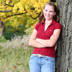
pic #1: I like the "tough chick" expression on her face, but am not loving how she is looking into the edge of the frame. Also, I know I clipped the edge of the chair..bummer.

f/6.3, 1/250, ISO 160 @ 50mm

3591608382_3ab0b330c7_b.jpg


Pic #2: Ok, imagine me..sitting on the ground, holding the reflector with my feet stretched out as far as they would go, leaning back (getting in my ab workout) to get this picture completely in the frame..and I STILL clipped the chair!!

f/5, 1/400, ISO 160 @ 50mm

3590798593_51e0ce7cfe_b.jpg


This last shot was taken with a flash bounced off the wall behind me. I know I STILL managed to clip her elbow.

f/2.2, 1/250, ISO 160 @ 50mm

3591608120_4852929261_b.jpg


Thanks for your input. I took some really great shots over the past couple of days, but most of them were up close and filling the frame..I guess this was a good assignment for me. I am now aware of this and will hopefully add some variety to my photography.
 
You have shadows on her face in the first two and as you pointed out the clipping does not help. I love the lighting on the last one.
 
You have shadows on her face in the first two but I love the lighting on the last one.

Thanks, yeah I probably should have had the reflector forward a little on pic #2 to help fill the shadows more evenly.

Thanks for your input.
 
I really think the rule of thirds makes for some strong images here, especially number two where the eyes are placed perfect.

The only other thing I can comment on is the inconsistency of your white balance in the first two. I think it looks pretty good in photo 2 though.

Thanks for sharing!
 
I pretty much agree with what's already been said. I like how bright her eyes are in the second photo. She is very cute. :)
 
I think this a good set of shots! And it is nice to see your focus much tighter on these!

1. I don't mind the direction of her head. Yeah, most people will say to have your subject facing the open portion of the frame but I don't think that's such a big deal here. The clipped chair is pretty minor too. I really like your lighting here, it's even, it's soft and it looks great on her skin. The comment about the white balance is appropriate because it's not that this WB is off, but when you have two shots with the same scenery, you want to keep it consistent. I like the warm effect of this WB setting though. To address the theme, you could probably give the right side of the frame some more space. I think I'd prefer her nose to be the point where the two 1/3 lines intersect rather than her eye, but your placement still looks good.

2. "A" for effort here! I think the execution is good, although the lighting is a bit hot on the right side. Your reflected light looks great though, and if the main light matched, the lighting would be perfect. I think this photo most strongly follows the rule of thirds, as her face is right where those two lines intersect. Recommendations: Avoid white clothing in hot light, and adjust your subjects position if the lighting is difficult to work with (not just all of your gear). If you had her facing directly opposite the main light source, the sun would act as a rim light and you could reflect that light evenly on her face.

3. Very cute shot, although it could've benefitted from having more room in the frame for her elbow and crown. I like the soft lighting you have here and the only thing I'd complain about concerning it is that bringing the room light up makes the skin/room color too similar.

Nice shots though! I think your hard work is paying off and your daughter's are going to have modeling contracts by the end of this :).
 
... most people will say to have your subject facing the open portion of the frame but I don't think that's such a big deal here...

I was actually going to say that I felt the 2/3 of the frame should've been on the left (in other words her facing the open portion). The impact in this specific pic is subtle cuz there is a lot of space there but, to me, it still feels weird.

Maybe it's conventional thinking but I feel like this is one of those rules that once you're aware of it... you notice every pic that breaks that rule.

I think the take-away for this is that the pic looks good as it is and by having the person facing the shorter side of the print you will likely get more people critiquing it than having them face the open side.

* I just noticed that her body is facing into the pic which is probably why it feels ok that her head isn't. Just wanted to point that out... if her body was facing out of frame I'm sure it would stand out more.
 
Last edited:
Farking IE8. Whole post lost. :grumpy:

Short version, cuz I am pissed right now.


I like 1 better than 2. I like the warmth it has, and her contemplative gaze. The gaze outward works cuz her body faces in, contrary to the "rule" as previously mentioned. I couldn't figure out why I didn't mind it breaking the rule, thanks rmh159.

#3 is my favorite of the three. Yeah, wish that crown wasn't chopped.
I really like the lighting here. For me it relayed that "just woke up" bright light eye adjustment feel, of waking up after sleeping in on a warm Saturday morning.

Did you scroll up to look at the pictures, come back down to your message, hit delete to backspace or go back to edit something you wrote and deleted the whole message..how did I know that?? Because it's happened to me SO MANY TIMES!!!! The old format didn't do that, but for some reason this one does. You have to click back on your message to continue typing after you scroll up. I HATE THAT because it is so easy to forget and then your whole message gets erased. I feel your frustration!! (Ok, now I hope that is what happened to you after that rant).

Will reply a little later about all of the comments. Thanks so much!!
 
Did you scroll up.....

No.
I upgraded to IE8, against my better judgement, an now I get arbitrary, random, frequent "errors". Often I get "IE has encountered a problem and must close" and I click cancel on that alert, and everything is fine. Nothing closes, just annoying.

THIS time, I was typing the message, and almost done, you know how wordy I can be, and I got the same alert, clicked cancel, as usual...this time it restarted IE, brought me back to the page, sans typing. *grrrrrrr*

I usually tab my response page, (new reply: open in new tab) so I can just tab back and forth between commenting, and the target image.
 
Use Safari. The added bonus to its stability is the ability to accurately render colors! :thumbup:
 
I think this a good set of shots! And it is nice to see your focus much tighter on these!

1. I don't mind the direction of her head. Yeah, most people will say to have your subject facing the open portion of the frame but I don't think that's such a big deal here. The clipped chair is pretty minor too. I really like your lighting here, it's even, it's soft and it looks great on her skin. The comment about the white balance is appropriate because it's not that this WB is off, but when you have two shots with the same scenery, you want to keep it consistent. I like the warm effect of this WB setting though. To address the theme, you could probably give the right side of the frame some more space. I think I'd prefer her nose to be the point where the two 1/3 lines intersect rather than her eye, but your placement still looks good.

2. "A" for effort here! I think the execution is good, although the lighting is a bit hot on the right side. Your reflected light looks great though, and if the main light matched, the lighting would be perfect. I think this photo most strongly follows the rule of thirds, as her face is right where those two lines intersect. Recommendations: Avoid white clothing in hot light, and adjust your subjects position if the lighting is difficult to work with (not just all of your gear). If you had her facing directly opposite the main light source, the sun would act as a rim light and you could reflect that light evenly on her face.

3. Very cute shot, although it could've benefitted from having more room in the frame for her elbow and crown. I like the soft lighting you have here and the only thing I'd complain about concerning it is that bringing the room light up makes the skin/room color too similar.

Nice shots though! I think your hard work is paying off and your daughter's are going to have modeling contracts by the end of this :).


Thanks again for your thorough critique. I hadn't thought about the colors (WB) being different in two similar settings, but that is a VERY good point that I hadn't considered. I will be careful of it in the future.

With picture #2, I had shot a bunch of pictures in the shade (like picture #1) then took the chair over to the sun to try out a bit of side lighting. I guess it was still too bright out to avoid the hot spots on her dress. I thought about attempting rim lighting, but I figured it would be much more challenging to get the exposure correct and I had one UNCOOPERATIVE 2 yr old at that point so I never got to it. Darn.

In regards to picture #3, you said that "by bringing the room lights up, it makes the skin/room color too similar". So should I have had a dimmer room? Would that have helped? I kind of like the coloring in this one, but can see that this wouldn't look that great in all situations. And I agree about the crown and elbow...such a bummer that I managed to clip them.

Thanks again and in regards to the modeling contracts for my girls...anything that will help pay for college would be warmly welcomed in my house ;). But I'm afraid everyone is already tired of seeing my kids, the last thing they would want is their face to show up yet again in their mailbox on the Sears catalog. Thanks for the compliment.
 

Most reactions

Back
Top