Kimba
TPF Noob!
- Joined
- Jun 7, 2009
- Messages
- 168
- Reaction score
- 0
- Location
- Brisbane Australia
- Can others edit my Photos
- Photos OK to edit
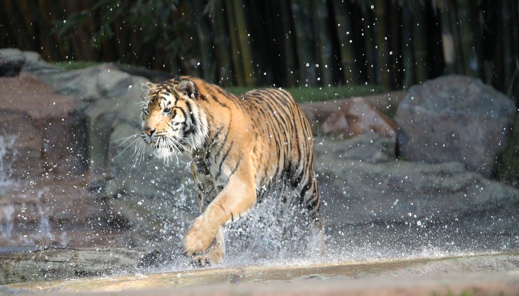
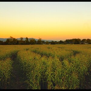
Took some Tiger photo's yesterday and looking for any help on how to make my shots better.
Shot with my new Canon 500D rebel
#1
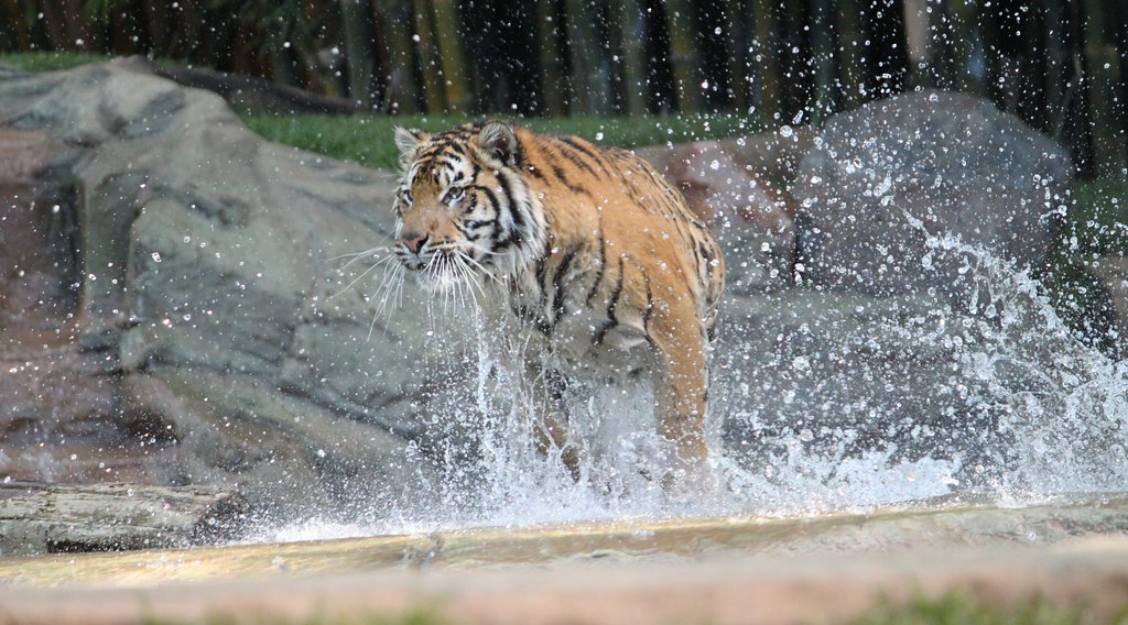
#2
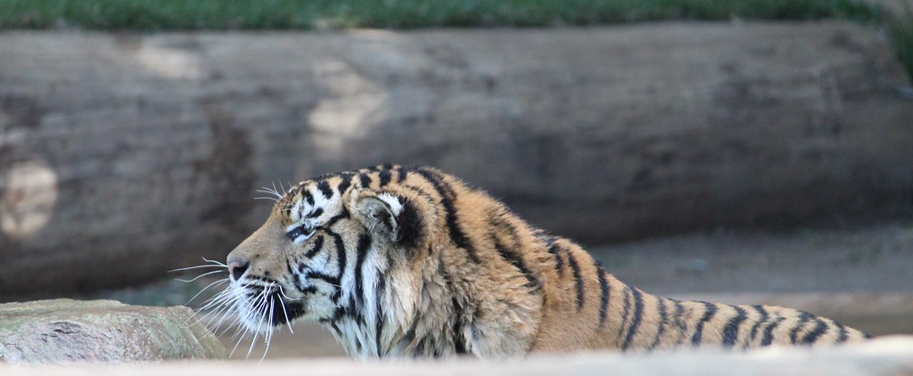
#3
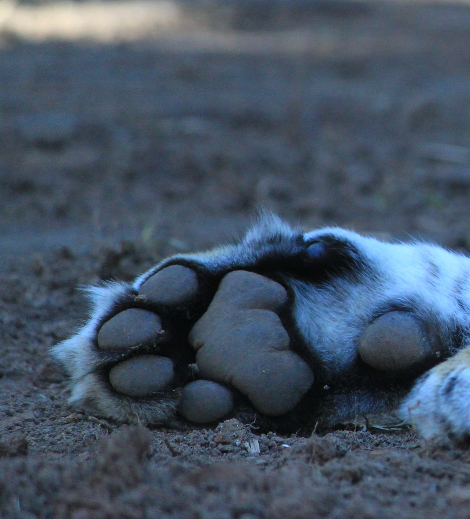
#4
#5

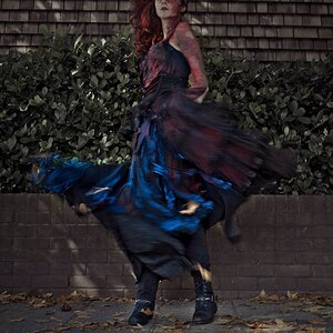
Shot with my new Canon 500D rebel
#1
#2
#3
#4
#5


![[No title]](/data/xfmg/thumbnail/39/39470-ad2036a502fde3b73f73e2b45e674866.jpg?1619739042)