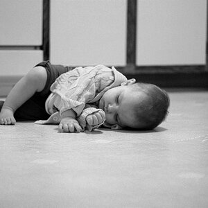
The top is a very nice portrait. I like how you embraced the shadows and diminishing light in the other two shots. The last two images tell a much different and deeper story than the first.
First two are, AFAIC, perfect.
The last has two small things that are really personal preference.
I would rather a larger space at the bottom so that he seems more isolated and not close to something.
I think a tiny bit of lightening the face so it is in concert with the lightness of the wall and the wall isn't too much brighter than his face. Then the shadow on the wall all makes sense.