What's new

Which one?

DGMPhotography

Been spending a lot of time on here!
Joined
Mar 23, 2012
Messages
3,160
Reaction score
717
Can others edit my Photos
Photos OK to edit
Some shots from a recent shoot.

I like both of them, but I feel like they're too similar to use both. Thoughts?
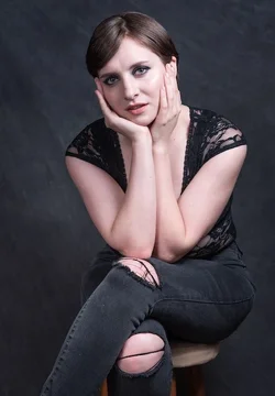
Screen Shot 2018-06-22 at 2.50.52 AM.webp Screen Shot 2018-06-22 at 2.50.59 AM.webp

TIA!
 
Agree, the second pose looks more natural and less forced.
 
Agreed the second one. I would however either crop or burn the knees, as they drew my eyes away from the subject.
 
not much of a fan of either, im afraid.
 
not much of a fan of either, im afraid.

The first is definitely better, but I agree with Braineack... Some additional photography is needed. Hands everywhere... and SO much arms. The back of the hands (as in the second) is less flattering. Even with the fingers tucked, they take up as much area as her face.

Good model. Good choice of background with this outfit, but needs different lighting scheme to work with the sleeveless top.

Good concept!
-Pete
 
not much of a fan of either, im afraid.

The first is definitely better, but I agree with Braineack... Some additional photography is needed. Hands everywhere... and SO much arms. The back of the hands (as in the second) is less flattering. Even with the fingers tucked, they take up as much area as her face.

Good model. Good choice of background with this outfit, but needs different lighting scheme to work with the sleeveless top.

Good concept!
-Pete

You put into words what I couldn't figure out in my head.

Too much arms.

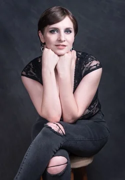
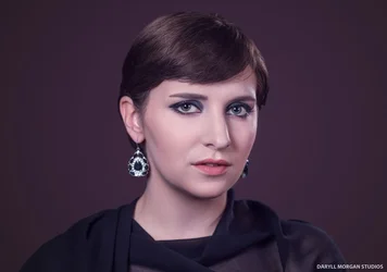
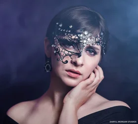
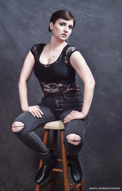
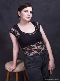
Thanks for the feedback, everyone. Here are some other shots!

1Rachel Hindman May 2018 - Daryll Morgan Studios-3.webp
2Rachel Hindman May 2018 - Daryll Morgan Studios-7.webp
3Rachel Hindman May 2018 - Daryll Morgan Studios-9.webp
4Rachel Hindman May 2018 - Daryll Morgan Studios-17.webp
 
Bump.
 
not much of a fan of either, im afraid.

The first is definitely better, but I agree with Braineack... Some additional photography is needed. Hands everywhere... and SO much arms. The back of the hands (as in the second) is less flattering. Even with the fingers tucked, they take up as much area as her face.

Good model. Good choice of background with this outfit, but needs different lighting scheme to work with the sleeveless top.

Good concept!
-Pete

I agree...I prefer the first frame, where she cups her face in her hands; the second frame shows the backs of both hands, and is less-appealing to me. Still...neither pose is very flattering.
 
Of the first 2, I preferred the 2nd but the critique that followed was well thought-out and helpful.
 
Should I make a new post for the new photos?
 

Create an account or login to comment

You must be a member in order to leave a comment

Create account

Create an account on our community. It's easy!

Log in

Already have an account? Log in here.

Back
Top Bottom