WTF Flicker

I still can't believe this. This is the current embed photo code:


Now Flickr says they want to force you to link back to Flickr, fine, but they actually removed the line of txt under the photo that would actually display the word Flickr in txt for all the damn search robots to pick up on?!

What they did before was clever. there was actually 3 links. That's SO much better for them and us.

You put a direct link on the photo itself, you put a text link on the title, you put a link to the member's photostream directly, and then you added text to advertise what damn site the photo was posted:


Steuben Glass Eagle by The Braineack, on Flickr

This manner looks so much better for the poster and actually advertises, for free, where the damn photo is hosted. For a robot searching for links and text, the previous embed code was worlds ahead--in the manner you were able to use it, and in the way it functions.

:facepalm:
 
I don't know what happened but in the last 5 years or so I think the quality of interface design courses must have nosedived because all these new interfaces are doing is making things HARDER than before. I mean seriously they've gone with all these fancy symbols to show information that used to be shown by default on the page with easy to read words that were - you know - direct and clear rather than ambitious.

Honestly I used to pay and was HAPPY to pay. Now I'm starting to get not happy and I'm no longer paying for it. I mean seriously you're doing something wrong when people are shifting from paying to free and are then even considering on leaving. And its not that the service has changed - its identical and reliable (I can't think when the last time their servers were down). It's just that they seem convinced that repackaging it in worse packaging is going to some how help
 
UI design, today, is about being trendy.

UI design should be about user center design process and user experience--making things easier, simpler, and better.

In the least, they should have used alt image tags/hints on the non-universally-understood icons so you actually knew what the **** you were about to click.


Also, it's offense that they made the switch without any sort of rollout. I didn't get an email to about when expect the change and what to expect in the change and I certainly cant find documentation that shows how the new interface functions. Let alone justification on why they think this is an improvement.

I have a feeling their "U"AT consistent of a bunch of 18yo designers living in their parent's basement showing a few old managers a cool new look/feel and it was signed off on.
 
I only got Flickr about 2 weeks ago. this is the first time i have bothered to put any of my work online as a "portfolio".
i wish i had waited a week to get it so i wouldn't miss the old interface....:grumpy:
i really liked the old way where Flickr put a link with the file name on it under the picture.

honestly, I thought I screwed up some setting...i was searching everywhere for the setting i accidentally hit that changed the sharing layout... one day its the old way, and the next day the new.
 
It's odd as normally they roll out a "here is where everything is now" intro page when they enforce a new interface - this time they just threw it out there without even a single word (unless you are part of the beta program of course - where I suspect most people were against the change and --- ignored).

Which is the thing - I don't see why flickr keeps re-inventing itself. I guess they are hoping if they re-invent to look trendy enough they'll get more users (since its new users that everyone worries about not the droves leaving by the back door ;)). You see the same thing in many other modern businesses - the best rates, best deals and best offers are for new customers - the established are forgotten.
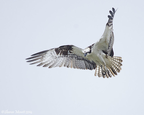
 
I hate you flickr! I found the pushpin but I hate the layout. I opted out when it was in beta. Now I'm forced to use it. I'm still a paying member also... urrr

^THIS. So VERY much, THIS. I tried it while it was in beta, lasted about two minutes before I switched it right back and tried not to have nightmares about what a godawful UI I'd just witnessed.
I'm also still a paying member...

... I do kind of miss the stats page though.

…because of THIS^. The stats are pretty much the only reason I decided to keep paying.
I'll hang around long enough to see whether they listen to the angry hordes--you know, the folks who actually have to USE this convoluted new system.

I didn't even realize it had switched, as I haven't been on my flickr in at least a week. Thanks to this thread, I did NOT freak out, and found it pretty easy to get a picture from flickr to TPF. But if I hadn't seen this thread first, I'd NEVER have figured it out.


And THAT is what really p*sses me off about it. If you're going to introduce some whacked-up new UI, heck, at least TELL us we're about to be screwed and give us at least a LITTLE hint here and there about where to find anything useful at all...
 
Honestly I think the code for flickr stats is broken. Most of the time it only shows two basic groups looking at photos. Flickr and "unknown". And even the flickr part isn't really that well detailed.

I had paid (mostly because the renew came in and after they shifted to free I forgot to disable to auto-renew); and honestly I don't feel like its worth it at all next to their free service. That should be a good thing - I should be happy; but since they keep messing with the interface and trying to move everything around all the time - its annoying. I've seen al ot of the discussion groups whittle down in activity and numbers on there; which is a sad thing.
 
I still can't believe this. This is the current embed photo code:


Now Flickr says they want to force you to link back to Flickr, fine, but they actually removed the line of txt under the photo that would actually display the word Flickr in txt for all the damn search robots to pick up on?!

What they did before was clever. there was actually 3 links. That's SO much better for them and us.

You put a direct link on the photo itself, you put a text link on the title, you put a link to the member's photostream directly, and then you added text to advertise what damn site the photo was posted:


Steuben Glass Eagle by The Braineack, on Flickr

This manner looks so much better for the poster and actually advertises, for free, where the damn photo is hosted. For a robot searching for links and text, the previous embed code was worlds ahead--in the manner you were able to use it, and in the way it functions.

:facepalm:
Exactly and a great example how they screwed things up.
 
Your embeding options also dont save like they used to. So where I could embed a photo here with two clicks: 1. press the share icon. 2. copy the code. It now takes me 4: 1. press share icon. 2. press pin icon 3. select size 4. copy code.
 
My dad use to have a old time saying he use to say to me, if Ain't broke dont fix it but if you have to, do it the right way.
 
Your dad made entirely too much sense, we can't have that! I hardly use my Flickr page and now I'm afraid to look...

Changes seemed to occur along with the company bringing in a new CEO; that and other sites as well seem to be formatting for it to work on a phone and the heck with those of us on a computer I guess.

I may just remove what little I have on there, close out the account and be done with it. If people pull their pictures and stop using it that might get the message thru, I already quit using MyYahoo (yeah, that'll show 'em! lol). But seriously if it's not good no point in using it is there.
 
Changes seemed to occur along with the company bringing in a new CEO; that and other sites as well seem to be formatting for it to work on a phone and the heck with those of us on a computer I guess.

Did he used to work with Microsoft on Win8?

If you want to change the mobile site to work better fine, but that's what mobile sites are for. The current site is not reactive, nor should it be. If you want to somehow work in Flickr on a phone/tablet, then they should develop an app for it.
 
Oh no windows 8 what a mess. Good luck trying to start up in safe mode when needed but that's another 10,000 post thread in itself. Maybe flicker is in bed with Microsoft, lets re-design the UI after a 10 day crack binge.
 
Sad part is that Win 8 as software runs really darn well in my experience. I actually enjoy using it - just not interacting with its stupid interface design choices :(.
 
We have 3 laptop on windows 8, 1 desktop on windows 8, I put classic Shell free on all of them to bring back the start menu.
 
Last edited:

Most reactions

Back
Top