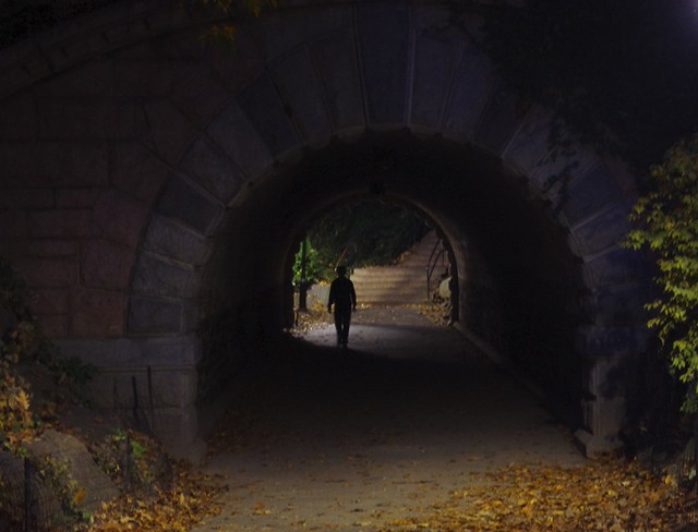
with 1, I actually like the bright foreground, as it gives some travel. Since the bright foreground attracts the eye, you end up moving back and forth between the foreground and the person. The person is strong and mysterious enough that you can't not look at it. Especially since he is enclosed in a circle, which will naturally draw the eye towards the middle of the circle.
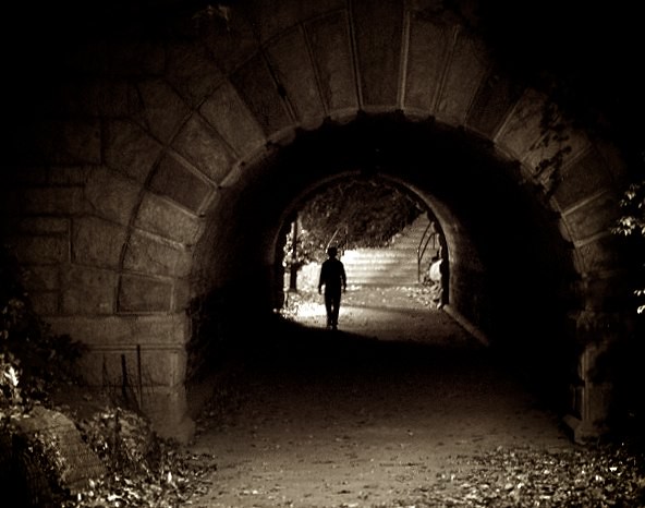
In the cropped version, I think it's very initially more satisfying, but I'm kind of done with it after a few seconds. Whereas the original got more eye time. TO me the original version of 1 has a story, whereas the cropped version is a sort of cool image. I might try it in B&W as well, since the color adds little if anything and the B&W might be able to make it a more stark image with more drama.
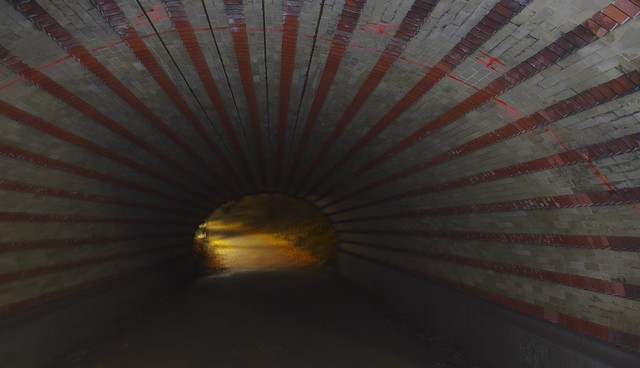
2 does nothing for me. The end is too blurry, the tunnel is kind of boring, and the flash is really obvious. I think it's a good idea in theory, it jus didn't work out here. I think this is an image where you'd need a tripod, something going on at the end of the tunnel and a REALLY EXPENSIVE lighting setup to pull it off well.
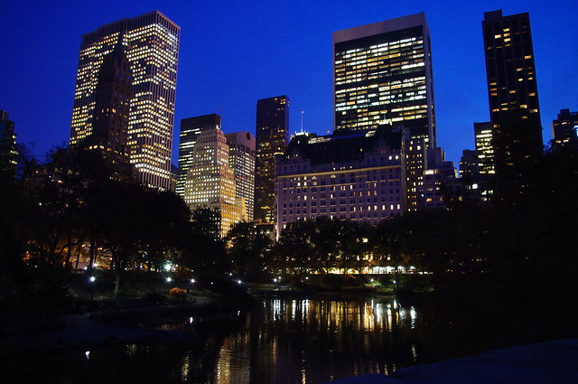
3 is nice and satisfying, but doesn't stand out.