I like that first one a lot! And the 4th one too since there is eye contact and I always crave that
")
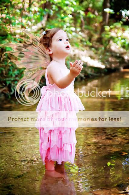
The two main things I'm seeing that you could work on is composition and skin color. In that first one, her skin is extremely pink. I saw you didn't have a "do not edit", but let me know if you want me to take this down.
Basically, working in layers, I decreased the red and erased back her dress so it would still be really pink, but her face wouldn't. I used the color balance tool to help get her skin a more natural color as well. I have also discovered that upping the brightness & contrast can really add some pop to my images and thought it would help on this one. Lastly, I added a layer of soft light and then decreased it to about 50% or so. I erased back her face just a little as I thought the soft light looked really good on the river, but wanted a little less on her face.
As far as the composition goes, I think this one would have looked really nice if you had centered her less and included all of her fairy wing. It really is such a nice expression and pose on this one!
In that last one, I would probably do something similar to what I did with your first, but I would also darken the background more so my eye would be less drawn to it. As it stands it sort of competes with her. I would also crop in a tad closer to her. Also, be careful with removing as I can see where you did and it looks a little weird.
Hope that helps


![[No title]](/data/xfmg/thumbnail/32/32174-b57e340fadfeea99045595146efd64b1.jpg?1734161047)


![[No title]](/data/xfmg/thumbnail/30/30884-b92cca2d3ad6f728825cf7e936e8cef6.jpg?1734158887)
