IMO, the real killer in this shot is the overexposure of the table.
If there was some texture in the table top then some PPing could make the background look better but the burnt out areas on the table really hurt.
a larger, darker ornate text style over the background and/or the table top would also pull the eye and kill some of the OE curse.
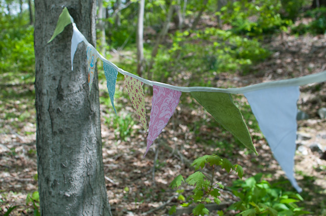
3 layers - background, flags, table and cups
darkened, saturated and lens blur background
didn't do much to flags
increased saturation on table and cups, area sharpen to make them pop. burnt in some places.
with full res image and more interest I would have masked out the very light parts of background and slid more foliage in before lens blurring it all.
Reading histograms save PPing and hair loss.

![]()
IMO, the real killer in this shot is the overexposure of the table.
If there was some texture in the table top then some PPing could make the background look better but the burnt out areas on the table really hurt.
a larger, darker ornate text style over the background and/or the table top would also pull the eye and kill some of the OE curse.
3 layers - background, flags, table and cups
darkened, saturated and lens blur background
didn't do much to flags
increased saturation on table and cups, area sharpen to make them pop. burnt in some places.
with full res image and more interest I would have masked out the very light parts of background and slid more foliage in before lens blurring it all.
Reading histograms save PPing and hair loss.
![]()
This one looks worlds better![/QUOTE]
It looks a tad underexposed plus there's a chromatic aberration around the teapot and cups... I wonder what he did to make that happen.

It looks a tad underexposed plus there's a chromatic aberration around the teapot and cups... I wonder what he did to make that happen.
I am open to CONSTRUCTIVE criticism because I want to improve my craft... not argue with trolls.
And thread after thread that you start is filled with constructive criticism that you resist. You constantly defend your position even and especially when you won't find another single photographer, pro or serious amateur, who will agree with you. Overexposed isn't a "style", it's a lack of skills and fundamental knowledge about exposure and the tools your camera provides you. To justify it by saying it works, when a million other people tell you "no, it pretty much doesn't", is seen as you being quite closed to constructive criticism by those that are trying to help and guide you along. So relax, go to a good place mentally, take a good look within, and try to see why people who have offered up years of professional wisdom are turning snarky.
It looks a tad underexposed plus there's a chromatic aberration around the teapot and cups... I wonder what he did to make that happen.
You really are an ingrate, aren't you?![]()
Hmmm. I'm thinking you need some monitor calibration, a better monitor, or at least turn the brightness up a bit. It's not under at all. If it were me editing, I'd probably pull it back even a bit more.
It looks a tad underexposed plus there's a chromatic aberration around the teapot and cups... I wonder what he did to make that happen.
Well, let's ask him why don't we?
Well, since you asked, that's not chromatic aberration - the failure of a lens to focus all the incoming colors to the same convergence point.
It is haloing caused by sharpening the cups layer.
If the sharpening had been done on a high res - and nicely saturated - image rather than the lo-res image available, the masking and layering could be more finely done and there would be no haloing. I did the area sharpening (high radius, amount to taste) to give the surfaces of the cups more pop.
I hope that helps.

No, high key is a style. High key retains detail. Over exposure blows out detail. Your pics are overexposed. And more than "slight". And I was serious about the monitor thing.
What makes you think I wasn't in my reply?
Oh so I should be grateful for this edit???
No, high key is a style. High key retains detail. Over exposure blows out detail. Your pics are overexposed. And more than "slight". And I was serious about the monitor thing.