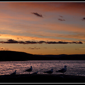
POINT OF VIEWS ""

Joined
May 13, 2007
Messages
453
Reaction score
0
Location
Vermont
Can others edit my Photos
Photos NOT OK to edit
Ok Folks , the newbie again... This will be my third post here in Critique, as I'm trying to test the waters here, seeing how this works... I will be jumping in here real soon, to put my 2 cents worth in...

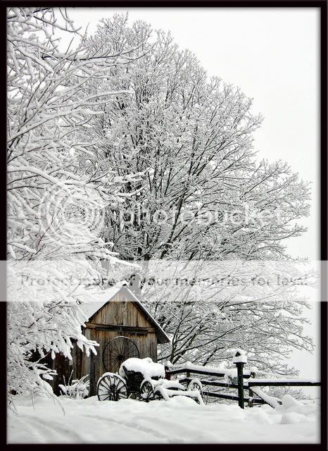
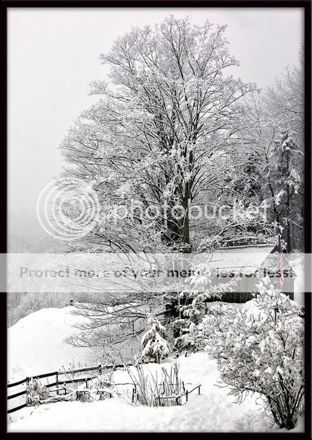
Throwing these two out for ya,, to get your opinions on Perspective, so lets hear it... or anything else you would like to throw in...

Again , I am a newbie to this forum, but far from newbie to photography.. and look forward to participating with opinions myself.. I think after these couple, I will pretty much know how it goes..

So lets hear it PERSPECTIVE/ or any other 2 cents you would like to throw in..

and by the way, NEITHER of these shots were selective color, the color you see Minimal/ is all the color there was...1st shot barn color/ 2nd shot Flag

this could be a part of the perspective in the shots?????


wakeupcall1.jpg


tonight.jpg
 
The perspective in the first one is boring...it's just a straight forward shot.

Second one is no good. The subject is way too cluttered.
 
Max......... Critique is Critique... Rude , well thats flat out un called for...

but after looking for some of your work, I did manage to see a shot of a horse and a person putting there head to the horse head...now that by no means could be listed as boring, even though its been done thousands of times.... so with your photographic skills, you may want to lighten up...

Critique can be done in a nice way, maybe you should practice that, cause after looking at that pic of yours of the horse, one only knows you are truly a master of the camera lol...


P.S. Can I put you on my buddy list.....
 
elsapet... Thank You... and hoping it will be a postcard... taken this past winter, and a part of my winter selection portfolio,,
 
you'll learn that Max is our "in-your-face" critiquer. Sometimes he posts with less than admirable tact, but luckily what he says is (almost) always true.

But really, with the second picture i would never have throught the subject was the flag if you hadn't said so.

My vote is for the first one by a landslide. It's a very simple picture that is, in my mind, the perfect depiction of winter. If it weren't for the fact that winter was over I'd ask you to sign the corner and send me a hi-res copy for my background.

:thumbup:
 
xfloggingkylex... Thank you , I appreciate this!! also want to add that I didn't mean to apply that the flag was the subject.. I simply wanted to explain these two shots were not done using selective color..
 
I think you're the one in need of lightening up. Don't ask for a critique if you don't want one. My critique is that the perspective in the first one is boring. If you wanna write it off as just some opinion, then do that, but there's no need to get defensive.

Edit: You seem to be yet another addition to the group of people on this forum who become easily aggravated when someone doesn't give them a pat on the back. So seeing as you've already written me off as a jerk, and responded to my critique by being rude, aggressive, and defensive, I'm just not going to ever critique your photos again, in hopes that we can avoid argument. Enjoy your time on the forum.
 
Consider yourself a lucky guy then New England Moments! :) lol
Lots of people on here give good thoughtful reviews.... Elsaspet, floggingkyle.. the two on here for instance.
There are only a couple out of the many here that have zero tact. You wont suffer by missing out on a couple of reviews.

I do like the first photo much better. I like the way the shed pops out from the snowy cold background. The second one doesnt feel very balanced to me.
They remind me of the nasty winters in Michigan I hope to never see again. lol
 
to bad more people dont give a critique like max.
its hard to give a critique in typing and not come off as rude. Or you have to type out all the nuances of speach that make a critique less rude....

i wish more people gave an honest critique instead of dancing around the issue and saying oh yes your photo is so good but maybe could you think of changing just a little but only if you want etc etc...
I hated critique in my photo class because everyone was afraid to say something negative about someone elses photos and thus, no one learned from the critique, yes there were a few brave souls who didnt care and said what they didnt like about a certain photo and i much enjoyed his critique far more then anyone elses. (plus the teacher wasnt afriad to tell me my photo sucked)


second. Just because someones photos arent the best ever doesnt mean they dont know anything about photography.

third, if you want someone to stroke your ego and tell you how great your shot it, dont post it here. the point of this place is to tell you how we think you could make it better. post it in the general gallery if you want ego stroking

last. while the first is a well done shot, its been done before. it looks like a postcard and i find it boring because it looks like a postcard
the second one is cluttered while also falling into postcard syndrom.
 
Personally I like the first photo. The 2nd one is good as well - but I didn't see the flag the first time I looked at it.

Mahalo, Kristen
 
Well, I would like to clarify my critique.

NewEngland, it appears that you have a particular style you're going for in your photos. If you were contracted by a post-card company, or a ski resort, or even someone who wants something to hang in their chalet at Stowe, then okay. But regardless of what purpose the photos have, you plainly asked about the perspective. My critique was that the dead-on perspective in the first shot is boring. Post card companies, ski resorts, and yuppies all tend to like that kind of thing. So if that's what you were going for, then well done. But in and of itself, the perspective is still boring.

I won't bother defending my critique of the second shot. There's no doubt that it's way too cluttered.
 
i like the tree as the subject in the second one. it stood out as much before i read all the posts about the flag and subject confusion but it works for me =)
and on the subject of boring... boring is subjective. totally subjective. i wasn't bored. the first one is maybe a little too crisp/contrasty with the trees and dark wood? i'd like to see it with some kind of very faint fuzzy wash maybe- like there's still snow blowing around. something a bit more dreamy- and postcard-like =) i mean, they look like they could be paintings, would a wash be a bad idea? i know how people get about PP effects turning photography into graphic art... so if anyone's panties are gonna get in a bunch at the suggestion i take it back! hah.
 
I'm going to come down in both camps here. God it hurts to stradle a fence.

My first thought was Courier and Ives, but way too much to comprehend for a christmas card in my opinion. I think that a christmas card wants to be simple with a strong point of interest. I like the desaturated color in the first one. I do a lot of it so I have to like it.

I like the foreground in the first one but not so much in the second. It seems to be distracting rather than a foreground to create depth. In other words it doesn't create depth but becomes a major element. Just doesn't seem quite right.

So my opinion is. I like them both but some of the elements seem a little out of place but then as in he mood thing I wasn't there. I'm just looking at it as a personal thing. You should be able to take what is said here toss out what you can't even begin to wrap your head around, then just consider the rest. In the end it's YOUR image not ours. Everyone isn't going to have the same view of every image.
 
The perspective in the first one is boring...it's just a straight forward shot.

From what angle would you have taken it, higher, lower, closer, or farther? While I frequently agree with your blunt critiques I think if they included suggestions it would make them 10x more helpful. I am seriously asking here... what is the better perspective?
 

Most reactions

New Topics

Back
Top