I'm going to be the odd one out.
I like the first one.
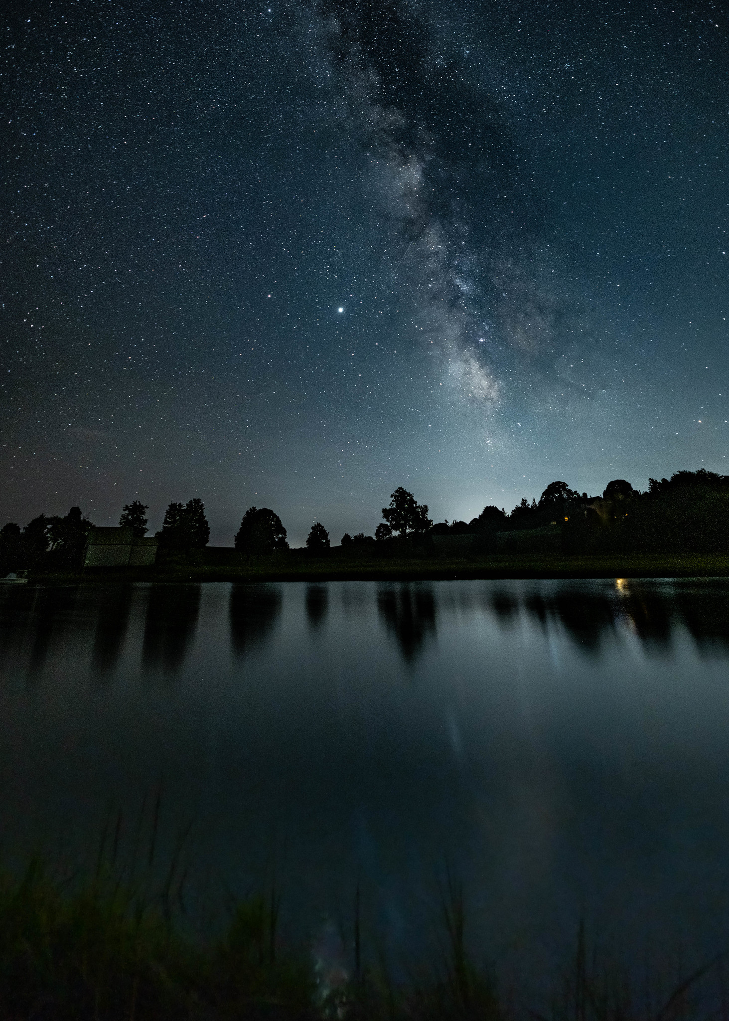
Yes, you can see the Milky Way more clearly in the second version. And I agree that the second version is better with the bottom part cropped. Those two edits would make this a pretty, technically-proficient image.
I just get a lot more feelings from the first one and feel it's the much more interesting edit. You don't see the Milky Way as distinctly, but unless you want this image to be all about "Milky Way! And silhouette landscape!" then you don't really need to see all of those details. The first image is dreamy, almost spooky - it's as much an image of an atmosphere as it is of the actual things represented in the image. The eyes first go from the the Milky Way and stars, to the silhouette of a sleepy town, and then the eyes travel down the soft reflections until they see those awesomely ghostly-looking reeds/grasses in the foreground. It's like going from the vastness of the universe down to the small details of life.
And I think a lot of that story, that atmosphere, is in the cooler tones that are more consistent throughout the image, and the fact that those foreground details are all but gone in the second edit. Also, that yellow light, which is less prominent in the first version, now becomes part of the story of the image (Who's still awake?") rather than a 'flaw' that you need to edit out.
 star gazing at the salt marsh by SharonCat..., on Flickr
 Salt marsh pano 3 by SharonCat..., on Flickr
 salt marsh milky way 3


![[No title]](/data/xfmg/thumbnail/38/38729-27329be54dcb93a3723bad97259e6428.jpg?1734172599)

![[No title]](/data/xfmg/thumbnail/31/31091-00a77a1c08cddcf7dc236d9317f868d2.jpg?1734159229)

