sam_justice
TPF Noob!
- Joined
- Jul 10, 2009
- Messages
- 555
- Reaction score
- 0
- Location
- Brighton, UK
- Website
- www.samueljustice.net
- Can others edit my Photos
- Photos OK to edit
Taking a different approach this time, but the idea of the composition remains the same.
"I want my image to look as though they're looking into the sky looking for there lost loved ones."
The sun was shining directly in front of the statue so I was able to get some nice silhouettes.
There are still some brush strokes in the sky since the post isn't complete but I wanted to show the composition. I had to duplicate the sky, flip it, and place it on top of the image to get the extra room for the composition. Still needs some cleaning up.
Been playing with various filters, some I've done myself, a couple are done through Nik Color Efex.
What do you think?
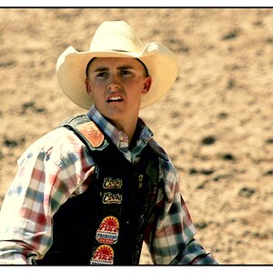
#1

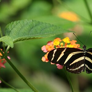
#2

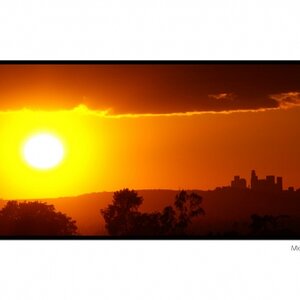
#3

#4

"I want my image to look as though they're looking into the sky looking for there lost loved ones."
The sun was shining directly in front of the statue so I was able to get some nice silhouettes.
There are still some brush strokes in the sky since the post isn't complete but I wanted to show the composition. I had to duplicate the sky, flip it, and place it on top of the image to get the extra room for the composition. Still needs some cleaning up.
Been playing with various filters, some I've done myself, a couple are done through Nik Color Efex.
What do you think?
#1
#2
#3
#4
Last edited: