Miss Kenddra, Derby girl and bacon lover.

12sndsgood

No longer a newbie, moving up!
Joined
Sep 24, 2010
Messages
2,349
Reaction score
360
Location
indianapolis
Website
www.square1photography.com
Can others edit my Photos
Photos OK to edit
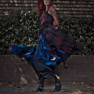
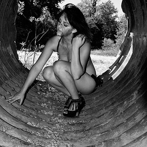
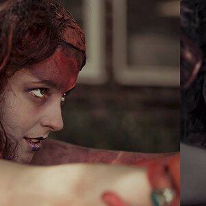
Hopefully the title pulled enough people in to have a look at Kendra, she stopped by last weekend and we had a fun afternoon. I think she kickstarted my 6 year old son into puberty. I'm finding i'm liking the dark background and darker lighting a lot so I was trying for that with this shot. We added in the glasses so I can work with the lighting and try to get better at that. and my favorite reason for shooting her (besides how cute she is) was her tattoo's. I'm still working on editing from the set, but just wanted to get a few up. be as honest as you like, these are put up to learn from.

These were all on a 1 or two light setup. one AB400 with 40x60 softbox as main light, and on SB900 used as a hair/rim light on some.

1.)


Kendra 005 by Square1 photography, on Flickr

2.) I don't do many B&W so i'd really like to know how I did here.


Kendra 006 by Square1 photography, on Flickr

3.) Yep she is an actual Roller Derby girl.


Kendra 004 by Square1 photography, on Flickr

4.)


Kendra 007 by Square1 photography, on Flickr

5.) sorry for the watermark, this was a downsized one meant for facebook and I just uploaded the wrong photo.


Kendra 002 by Square1 photography, on Flickr
 
I love this set. The soft light mixed with the bold colors works well. . The second and last are my favorites. The pose in the third fits the roller derby theme well, but the look on her face is a little funny.

The B&W conversion is nice, but I think the same shot would be equally great in color (I wanna see those tats!).
 
Good photos here, and I like the "progression" in your essay. Not a fan of the B&W either. Her skin art is worth some more photos.
 
Bacon Lover pulled me in.


I really like the last one in the set. This could fit nicely in Ink Magazine.
 
Thanks guys. She was great to work with. and just all the tattoo's were just so much fun to work with. I have a lot more photos of her that i'm excited to clean up. soon as i get a few paying jobs taken care of.


and this was the photo I had meant to throw up as to the bacon refrence Trever


Kendra 001 by Square1 photography, on Flickr
 
She rides? You didn't get her on the bike? Doh! too early for me, I see the roller blades now! :D
 
Definitely some good things going on here, but also lots of room for improvement IMO.

#1. There is a reflection in her glasses, probably from something bright in the room/studio. The glasses are a bit too low, almost blocking her eyes. It's great that you used a light to give separation between the hair & background, but a large section of the hair (top) is left too dark. I think this shot could use some fill light as well. I think that raising the main light up a bit, and maybe a bit more frontal, might have worked better for this one.

#2. Nice shot to show her ink (albeit without color) but I think it's lacking impact because most of her arm is out of focus (DOF). And because you've pushed her head up so high in the composition (and included her knees), the composition is telling me that the arm tats are an important focal point for the image...but they aren't sharp so the viewer may get confused. A shallow DOF can work well for this post, but for more impact, I think you should put the face is a more important spot and include less of the body etc.

#3. Skin tones look different in this one. Much darker and redder. Probably underexposed but watch your WB as well. Hair is dark and also starting to blend into the background.

#4. Much better lighting on the hair. I'm guessing this shot is to show off her tats, which it sort of does, but really just snippets of different ones and doesn't give the viewer a sense of what any of them are. The light on her face isn't great in this one, light is missing in one eye and also she's having to move her eyes so far around to look back at us, we see the red corners of her eye, rather than nice whites. Also, her knees are picking up too much reflection and causing bright spots in front of her face...might be better without that.

#5. This one nicely shows off her owl, but I'd also like to see the word at the top....moving her hair over her shoulder might have allowed for that. I don't mind that her face is only partially lit, it allows the tat to be the clear subject of the photo.

Last one. I like the lighting you have here, with a kicker on our left. However, I think the main light is a bit too low and the whole image is a bit underexposed. And again, her hair is dark and featureless and practically blending into the background.

I think that many of these issues could be solved with another light or two. That way, you could have a main light, a fill light, a hair light, a kicker and maybe another one for accent or just adding light where it might be needed.
 
Is it just my screen or does #2 and 4 look like missed focus? #2 seems like her forearm is in focus and missed slightly on the face. #4 seems shoulder is in, face is out.
Or it could be just me. :scratch:
 
Thanks Mike, a lot of good stuff here. i'm going to reply to some of the stuff and some of my reasonings. just so you know my thinking or issues i was having.

1. I was getting bad reflections off the glasses at first, so I kept turning her more and more away from the light. being a 40x60 it was having some big reflections off the glasses, then we tried to reposition the glasses to angle them down a bit so the (angle of incident?) was where it wouldnt reflect as much. it was definatly some learning and practice to try to get it where it was at. and was my first time with someone with glasses. I agree about the fill. Last winter I had up my light count to about 4 lights. and I was just getting junk trying to run before I could walk, so I have cut back on the amount of lighting I have been using to make things more simpler for myself and to try and learn more before I add more. I do agree I think so fill would have helped some. moving the light more frontal would have likely helped with the lighting on her face but would have taken us back to the glasses issue. definatly something I want to play around with more and practice with.

2. I agree with this. I think with her arm sleaved, it pulls your focus toward it. while when I was takig the shot, esp when I take this type of shot, im' usually going for the eyes. but her sleeve just demands a lot of attention. and being a bit soft due to lack of Dof does take away from it a bit. And posing is always something i'm working with. I know I have a long way to go in that area.

3. I think the red tones were likely me and my processing. I am a bit color blind. sometimes I'll pull the wife in if im having a hard time. likely was later at night and tired and got a bit off. I do think another hair light on the right side would have lit her hair up a bit and blended it less with the background. just goes back to not using as much lights yet. One thing I want to do is get some matching lights. All of lights are diffrent and i wind up spending a lot of time trying to match and adjust. I do have a light reader, I think its maybe time I start working with it more and working on lighting ratios.

4. i agree about the eye, that's one thing I have been trying to get better on because I tend to like the looking back pose. Likely I took this shot then adjusted her eye lol. Noticed on this shot my background is a bit lighter as well. so thinking in the shot before it where her hair blended in I likely bumped up the darks which probably made her hair blend in worse then it would have been (have to look at that when i get home) i see what you mean about the tats. Probalby something I didnt even think about because I have so many of her tattoos in other shots for this one it was probaby more about her and the pose then highlighting the tats. (or at least that's my excuse and i'm sticking with it lol)

5. this one is my favorite by far. I think i do have some of her hair moved. I just really liked how this one came out.

6. now that you mention the light being to low. I think it likely was a bit low for her. she was taller then most of the girls I had worked with. and in that shot she had her skates on which added another 3-4" to her and I don't think I adjust the light up for her when she was in her skates. so that's probably true about the light height, I didn't even think about that. The underexposure is likely a result of me pulling it back to make sure everything was dark. Probalby just went a bit to far with it.

and well you know about me pulling back on using more lights. I do feel i'm getting better with the lighting. just have to slowly work more lights in as I go.

thanks for going over them.
 
I was getting bad reflections off the glasses at first, so I kept turning her more and more away from the light. being a 40x60 it was having some big reflections off the glasses, then we tried to reposition the glasses to angle them down a bit so the (angle of incident?) was where it wouldnt reflect as much. it was definatly some learning and practice to try to get it where it was at. and was my first time with someone with glasses.
When dealing with glasses (especially large ones like that) you really do need to aware of the law of direct reflection...angle of incidence equals angle of reflection. The key is to know/remember that when you use a short lighting position, the glasses will likely reflect the light source. But when you use a broad lighting position (like in #1), the angles won't line up and you won't see the reflection.

The reflection that we do see, looks like something shiny in the room/studio, not the light.
 
okay, good to know. I didn't think about that. I just ended up turning her farther away from the light instead. looking like the reflection is the edge of the wall that leads to the kitchen.
 
I looked at the images on Flickr at Original resolution. My comment is that it seems like your focus is a tad bit off in some shots. ALso, the frames of the female singer on stage at the motor festival show some subject motion blur. Your D7000 qualifies as high-resolution digital...the minor focusing issues are not all that noticeable at typical screen sizes, but I can see that a leeeedle bit smaller aperture would have bailed you out of a couple of these frames. Again, this is only when looking at the images LARGE. I do like the bacon + hemet expression she has! I also like the pose, and the way the arms make a circle, which closes, or reinforces the pose!
 
Thanks Derrel, I probalby do keep my aperature a bit to wide in some instances. For the Moto GP photos of Linday Sayyeah, I was out trying my hand at the motorcycles and she happened to be on stage as i was on my way out. I didn't take a lot of time to really find the best location and I don't think I was caring for the backgrouned so i likely opened it up in hope of getting some more blur in the background. I wished I would have had more time to shoot her and had spent a bit more time thinking about what i was doing. I also use a single spot focus point and probably don't have the steadiest hand so it's quiet possible im losing focus as well when im taking the photo. something for me to think on though.
 

Most reactions

New Topics

Back
Top