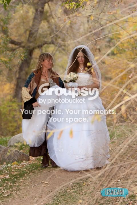
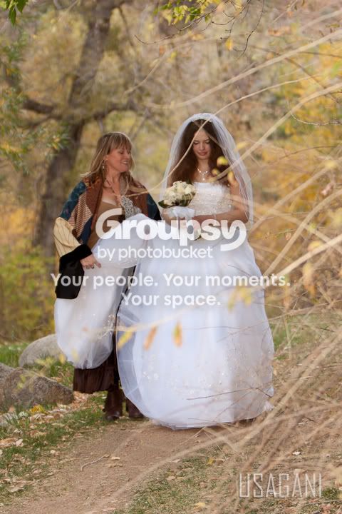
My impression of the various ideas are that they overpower the photos and that is where the eye goes first. Is is not a soft or a subliminal logo, its right there big and bold.
If you step back and take a look at the strength of the font and the size alone against the tender softness of the infant and the veiled softness of the bride, it doesn't flow.
So my two cents is try to find a more 'universal' design that will work to complement and add interest to your images. Right now the image and logo are at cross purposes. It seems you want to keep that trademark item in with your name, maybe make it small like a little prefix to the lettering?
I love the photos.




 )