How to increase contrast/brightness of product photos?

How far away are your soft boxes? I think the image could benefit from them being brought much closer.


Sent from my iPhone using Tapatalk

About 50 cm from the item... isn't that close enough? The item is pretty well illuminated in real life, it even looks great on the camera screen but it's getting dull when it's on the PC for some reason :)
 
Here is my try. Added a level adjustment layer and brought the blacks down, whites up according to the histogram (is that something you are familiar with?). I felt there was too much yellow, so I desaturated it with another adjustment layer (saturation). You could easily have these two adjustment layers as a photoshop action.
Well, and then it went overboard - wanted to show you how you could improve your shots using a bigger sheet of paper, plus maybe fix the perspective a little bit with the transform tab in Lightroom. You could, in fact, create a Lightroom preset with these, if you always use the same distance and, focal length.

Nice but still looks a bit gray and boring to me. Here's what I got after playing with levels and hue/sat:

twkaOQ4.jpg


I don't really care about the background, I want the item to kinda stand out.

My lighting setup is probably not as good as it could be but I'm not sure how to improve it.
 
Last edited:
Photoshop Levels is the easy way.

lev.jpg


Raising the Black point (Here to 64) makes that tone become zero, so this is blacker blacks.

Lowering the White point (Here to 215) makes that tone become 255, so this is whiter whites.

Blacker blacks and whiter whites is greater contrast. But depending on how much you clip these ends can of course cause clipping, so generally be mild. Just touching or slightly past where the data starts (as here) is generally best. Grayscale photos can use much greater clipping than color.

Crop it first, to remove the extraneous distractions in the histogram.

Lowering the Center slider (Here to 1.40) raises the brightness without this slider having any risk of any clipping. This middle slider does NOT affect the end points.
 
Without a calibrated monitor, any editing with contrast & color accuracy as a result is a moot point.
 
Without a calibrated monitor, any editing with contrast & color accuracy as a result is a moot point.

And most viewers of his site will not have photo calibrated monitors.

This has always been the issues with viewing images on the internet.
You have no idea how the monitor of the viewer is set, so you have no idea of how the image will really look.

But using a calibrated monitor will at least eliminate half the problem, so he is closer to a good image.

True. But when you see a dull photo, I bet it's dull for everybody :)
 
How far away are your soft boxes? I think the image could benefit from them being brought much closer.


Sent from my iPhone using Tapatalk

About 50 cm from the item... isn't that close enough? The item is pretty well illuminated in real life, it even looks great on the camera screen but it's getting dull when it's on the PC for some reason :)

Whoa,whoa,whoa...50 centimeters is way too close to have the main light! Due to the inverse square law, the background just a few inches behind the product will have horrible levels of fall-off in light intensity. You definitely want to move the softbox __farther away__ from the product, and give the product more exposure, with a longer shutter time being the best option in most cases.

If you want the background and the subject to have roughly the same light intensity, shooting with the softbox really close, like 50 centimeters is exactly the wrong way to do it, due to the inverse square law. Moving the light so it is relatively "far away" makes the light's intensity very even over the distance from the product to the background.

Dizzactly!
 
50 cm is just 19.5 inches or 1.6 feet.
Laptops are notoriously poor devices for critical editing of photographs, because the viewing angle is more variable and the display has to be re-calibrated if the viewing angle or ambient light has changed, and few laptops have quality IPS type displays.

I agree with Derrel.
Move the light source further from the subject so the light fall off is more even from the front of the product to the background.
Light Science & Magic: An Introduction to Photographic Lighting is an often recommended product lighting bible, now in it's 5th edition.
 
Whoa,whoa,whoa...50 centimeters is way too close to have the main light! Due to the inverse square law, the background just a few inches behind the product will have horrible levels of fall-off in light intensity. You definitely want to move the softbox __farther away__ from the product, and give the product more exposure, with a longer shutter time being the best option in most cases.

If you want the background and the subject to have roughly the same light intensity, shooting with the softbox really close, like 50 centimeters is exactly the wrong way to do it, due to the inverse square law. Moving the light so it is relatively "far away" makes the light's intensity very even over the distance from the product to the background.

So I tried to double the distance and use 1/10 shutter speed and even +1 EV but it looks even darker than before:

hbPl55Y.jpg


I actually don't want the background to be the same, I want the item to kinda stand out...
 
You have a vary narrow peak in the histogram, so you have a LOT of editing ability concerning brightness. In fact, you can bring your white point down to 230 and lose no data because 230 is the brightest point of the image.
 
Whoa,whoa,whoa...50 centimeters is way too close to have the main light! Due to the inverse square law, the background just a few inches behind the product will have horrible levels of fall-off in light intensity. You definitely want to move the softbox __farther away__ from the product, and give the product more exposure, with a longer shutter time being the best option in most cases.

If you want the background and the subject to have roughly the same light intensity, shooting with the softbox really close, like 50 centimeters is exactly the wrong way to do it, due to the inverse square law. Moving the light so it is relatively "far away" makes the light's intensity very even over the distance from the product to the background.

So I tried to double the distance and use 1/10 shutter speed and even +1 EV but it looks even darker than before:

I actually don't want the background to be the same, I want the item to kinda stand out...
If you want the item to stand out, why not use a different background color. Since you shoot more than one item, choose wisely.
 
Another thing I don't get is why correcting WB with a gray card and by setting the temperature to 5500K in Camera Raw in PS give different results and which of them is closer to real life :( 
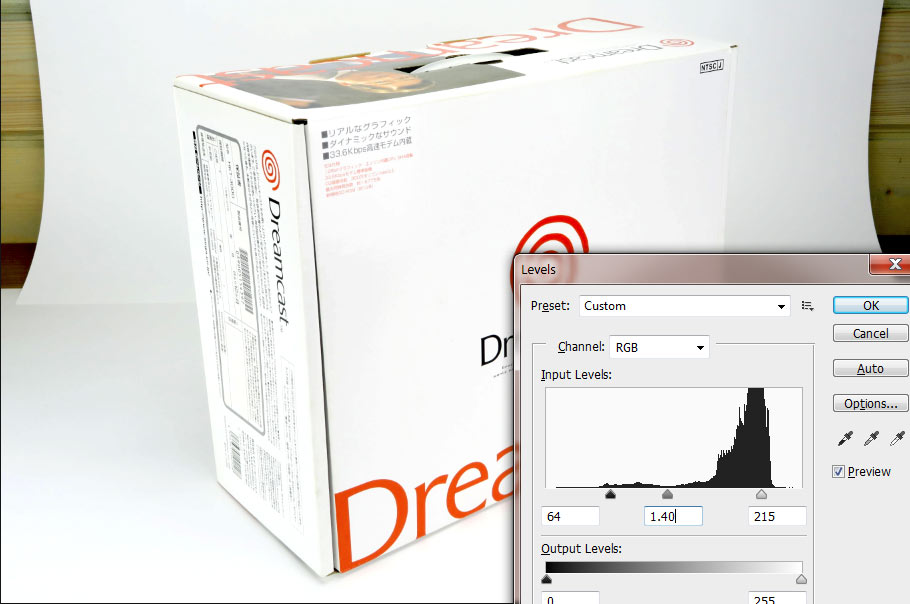
The latter is supposed to be more accurate...

snqsCEU.png


I always shoot in the same conditions - 5500K lamps and no other light sources. The gray card had no glares and I used a 5x5 average sample.
 
Last edited:

Most reactions

New Topics

Back
Top